Trying to find the right number in a crowded dashboard can feel like hunting for a pin in a haystack.
Tableau turns that tangle into something readable, usable, and far easier to act upon.
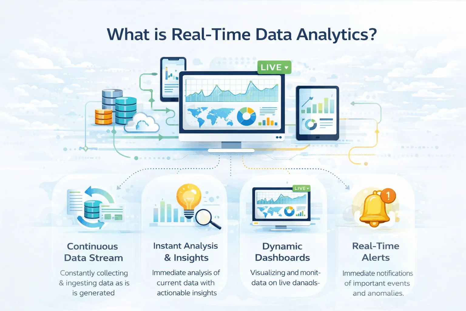
Data analytics with Tableau gives teams a more effective way to spot patterns, monitor performance, and make decisions before the moment passes.
For a tech and innovation brand like Augmented Lab, that means data becomes something people can work with, rather than merely stare at.
Why Data Analytics with Tableau Changes the Pace of Analysis
A well-designed dashboard can still require a lot from the reader. Someone needs to ask the right questions, look at the right data, and connect the pieces before taking action.
Tableau’s AI-powered features reduce that delay. A finance team can review margin movement, a marketing team can track campaign shifts, and an operations team can catch performance issues without waiting for a manual report cycle.
That speed is important because insight has a shelf life. When a pattern is visible while the issue is still live, the response tends to be sharper and more useful.
Tableau Pulse for Daily Visibility
Tableau Pulse is designed for the metrics that people frequently check. It monitors key performance signals and presents changes in simple language, helping teams stay informed without spending all day on a dashboard.
You can use Tableau Pulse when your organisation checks the things over and over, like how much money you make or how many people stop using your service. For example, a sales manager can quickly identify a drop in conversion rates and investigate the cause before the week is over.
If reporting needs a stronger structure around the metrics layer, data analytics services can help shape the foundation before AI-led summaries are layered on top.
It works best when the metric definitions are stable and well governed. If the KPI logic shifts too often, the summaries will feel less trustworthy.

Conversational Analytics for Faster Questions
Conversational analytics gives users a more natural way to explore data. Instead of building every view from scratch, the user asks a question and gets guided towards the relevant pattern.
It is beneficial when stakeholders understand the business issue but not the chart structure. A product lead might inquire about the decline in sign-ups and then analyze the data by source, region, or device to identify the cause.
For teams with mixed technical skills, data analytics with Tableau becomes far more approachable. Analysts still retain depth, while business users gain a clearer route into the data.
Tableau Ask Data and Discover
Tableau Ask Data works well for a focused question that needs a fast answer. In contrast, Discover is more useful when several related metrics need to be understood together.
This distinction matters in day-to-day work. Tableau Ask Data suits a quick review before a meeting, while Discover helps leadership see the wider story behind a change in performance.
| Feature | Best use | Practical value |
| Tableau Ask Data | Single question | Fast answer for one metric |
| Discover | Multiple related metrics | Broader context and trend review |
If the output needs a sharper visual layer for stakeholders, data visualization services can help make the insight easier to read at a glance.
Tableau Agent for Drafting and Exploration
With Tableau Agent, users can build visualisations, explain fields, and support analysis inside the platform. It is useful when a team wants a first draft before spending time on refinement.
That makes it a sensible tool for analysts who already know the business objective. A growth analyst can create a summary dashboard, analyze the results, and refine both the data and the accompanying narrative.
It should be used as a supportive tool rather than a definitive source. While AI can expedite the initial process, human judgment is essential for interpreting the business context.
Tableau Next Feature and Agentic Analytics
Tableau Next points towards a more autonomous style of analytics. It supports agentic analytics, where the platform can monitor data, surface relevant insight, and move information towards action with less manual prompting.
That matters in operational settings where delays create pressure. A logistics team can use it to watch fulfilment performance, detect a delay pattern, and alert the right people before the issue spreads.
When teams want a broader strategic partner for analytics and implementation, Augmented Systems can support the wider business setup around data, reporting, and delivery.
| Feature | What it supports | Example use |
| Tableau Pulse | Metric monitoring | Daily KPI checks |
| Tableau Ask Data | Question-based exploration | Single business question |
| Discover | Broader insight review | Multi-metric performance review |
| Tableau Agent | Drafting and analysis support | Faster chart and field creation |
| Tableau Next | Agentic workflows | More proactive insight delivery |
Where Teams Get the Most Value
The best results usually come from teams that already know their core metrics. If the data model is stable and the KPI definitions are clear, Tableau’s AI layer has a stronger foundation to work from.
Use data analytics with Tableau when the aim is to reduce the time between spotting a shift and responding to it. Marketing can use it for campaign tracking, finance can use it for variance review, and operations can use it for exception monitoring.
The real gain is not simply speed. It is confidence in the insight and clarity in the next step.
A Practical Rollout Approach
A phased rollout is often more effective than a full implementation.
- Start with one department and a small group of key metrics.
- Define KPI logic before enabling AI-supported insight layers.
- Train users to ask specific questions instead of broad ones.
- Review AI-generated summaries against source data during the first phase.
- Add more advanced workflows after the core reporting process feels stable.
This approach keeps the system useful instead of noisy. It also gives the team time to trust the output before wider adoption.
Conclusion
Data analytics with Tableau works best when teams want answers that arrive with less fuss. Its AI-powered features help turn scattered numbers into something people can actually work with.
When the reporting setup needs a steadier hand, that is where Augmented Lab comes in. We help shape Tableau into a setup that feels more useful, more practical, and far less of a slog.
Ready to improve your Tableau workflow? Contact us and schedule a quick call with our team today.

FAQs
1. What is data analytics with Tableau?
Data analytics with Tableau utilizes its visual and AI-powered features to explore data and uncover insights. This approach enables teams to transition from raw numbers to informed business decisions with reduced manual effort.
2. How does Tableau Pulse help with reporting?
Tableau Pulse monitors key metrics and highlights important changes in plain language. It is useful for teams that need ongoing visibility without constantly checking dashboards.
3. What is Tableau Agent used for?
Tableau Agent helps users draft charts, explain fields, and explore data more efficiently. It works well when teams want a fast first version before refining the analysis.
4. How is Ask Q&A different from Discover?
Ask Q&A is better for one focused question, while Discover is better for related metrics and broader context. In data analytics with Tableau, both help users move faster through analysis.
5. What is Tableau Next?
Tableau Next is Tableau’s agentic analytics platform. It supports more proactive insight delivery and helps teams move towards automated, multi-step analysis.
6. Why should businesses use AI-powered analytics in Tableau?
Businesses should utilize AI-powered analytics in Tableau to minimize reporting delays and identify meaningful patterns more quickly. This allows teams more time to act on insights.


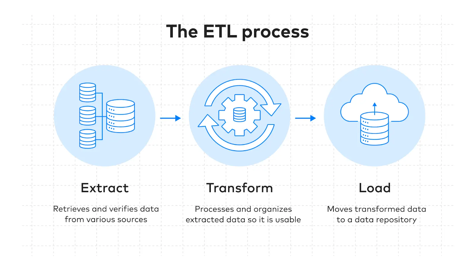 Before exploring specific platforms, let us first understand how you can choose the perfect ETL tool: