The problem with scaling data is that scale also scales confusion.
A data stack that feels manageable early on can get messy fast once more teams, tools, and workflows start using it. What once looked organized can start to feel like a jigsaw puzzle with a few pieces from the wrong box.
That is where data governance strategies make a real difference. They help businesses keep definitions aligned, ownership clear, and decisions grounded in data people can trust.
For growing teams, that matters because scale introduces more systems, more handoffs, and more room for inconsistency.
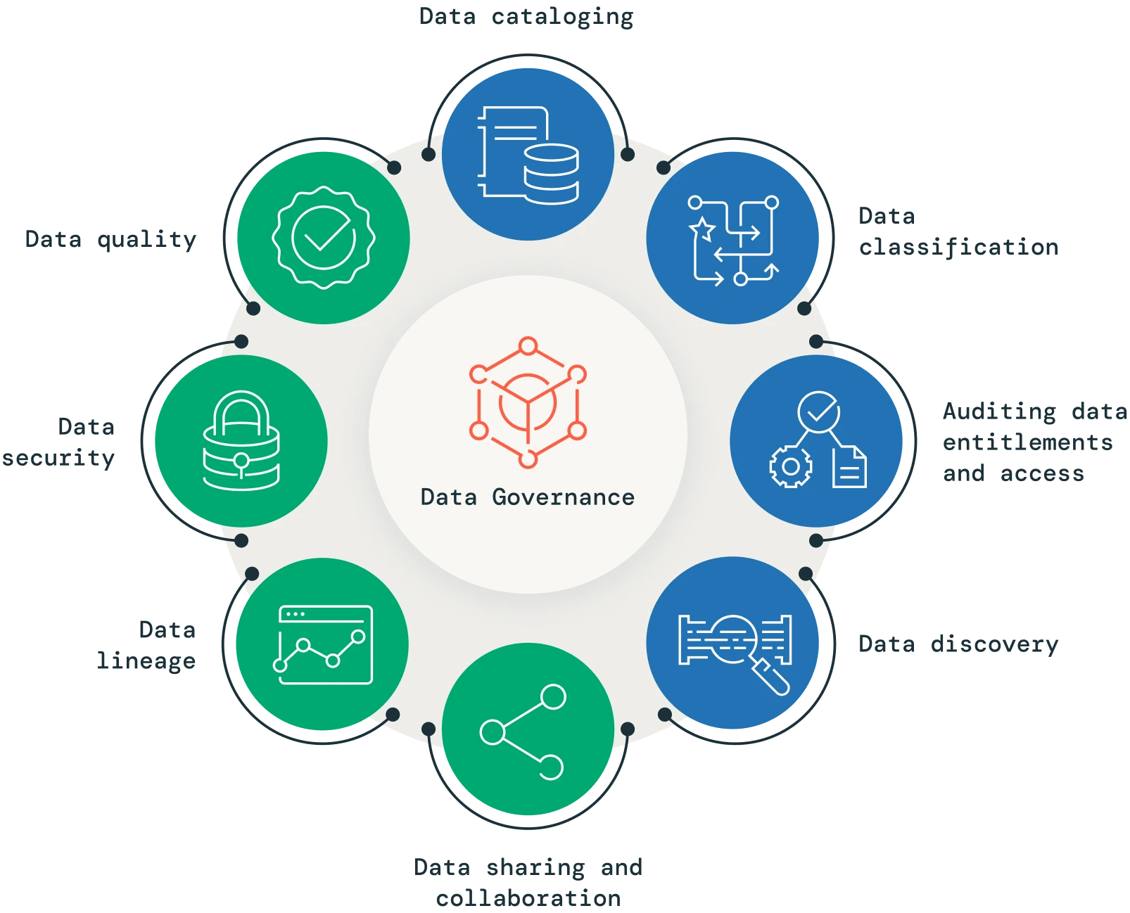
Why data governance strategies scale
Data governance strategies scale because they create repeatable rules for data that more people can use without confusion.
As systems multiply, those rules help prevent inconsistent definitions, access gaps, and reporting errors. That is especially important in environments that rely on cloud apps, warehouses, APIs, and AI workflows.
This is also why data governance is important for modern organizations. Informal habits may work when a company is small, but they start breaking down once more users and platforms are involved. Sales, finance, and operations can only trust the same customer revenue data when ownership, definitions, and update rules are clear.
Data governance standards help prevent small inconsistencies from spreading through reports, dashboards, and automations. That gives teams a common operating model instead of forcing them to reconcile conflicting numbers every time they need an answer. Governance models that scale
| Model | Best fit | Practical value |
| Centralized governance | Highly regulated businesses | Strong control and consistency |
| Federated governance | Large organizations with multiple business units | Local speed with shared standards |
| Hybrid governance | Fast-growing companies | Balanced control and flexibility |
A hybrid model often works best when teams need autonomy but still need shared rules. For example, product, finance, and operations may each manage their own workflows while following the same governance standards for access, definitions, and quality checks.
An enterprise data governance plan should match the operating model of the business. A rigid structure can slow teams down, while a loose one can create reporting gaps and unclear accountability.
1. Define ownership clearly
Ownership is the first step in making governance real.
When a dataset has no clear owner, issues tend to stay open because everyone assumes someone else will fix them.
Assign both business ownership and technical stewardship to important datasets. A business owner defines what the data means, while a technical owner ensures pipelines, permissions, and refresh cycles support that meaning. This works well for revenue, customer, and compliance data, where unclear ownership can create expensive confusion.
2. Standardize key definitions
One of the quickest ways to undermine trust is to let different teams use the same term in different ways. A shared glossary helps keep revenue, customer, and performance metrics consistent across the business.
This is a core part of strong data governance strategies. If marketing defines a lead one way and sales defines it another, reporting turns into debate instead of insight. The fix is simple but important: place agreed definitions inside dashboards, BI tools, and reporting templates so teams see them where the work happens.
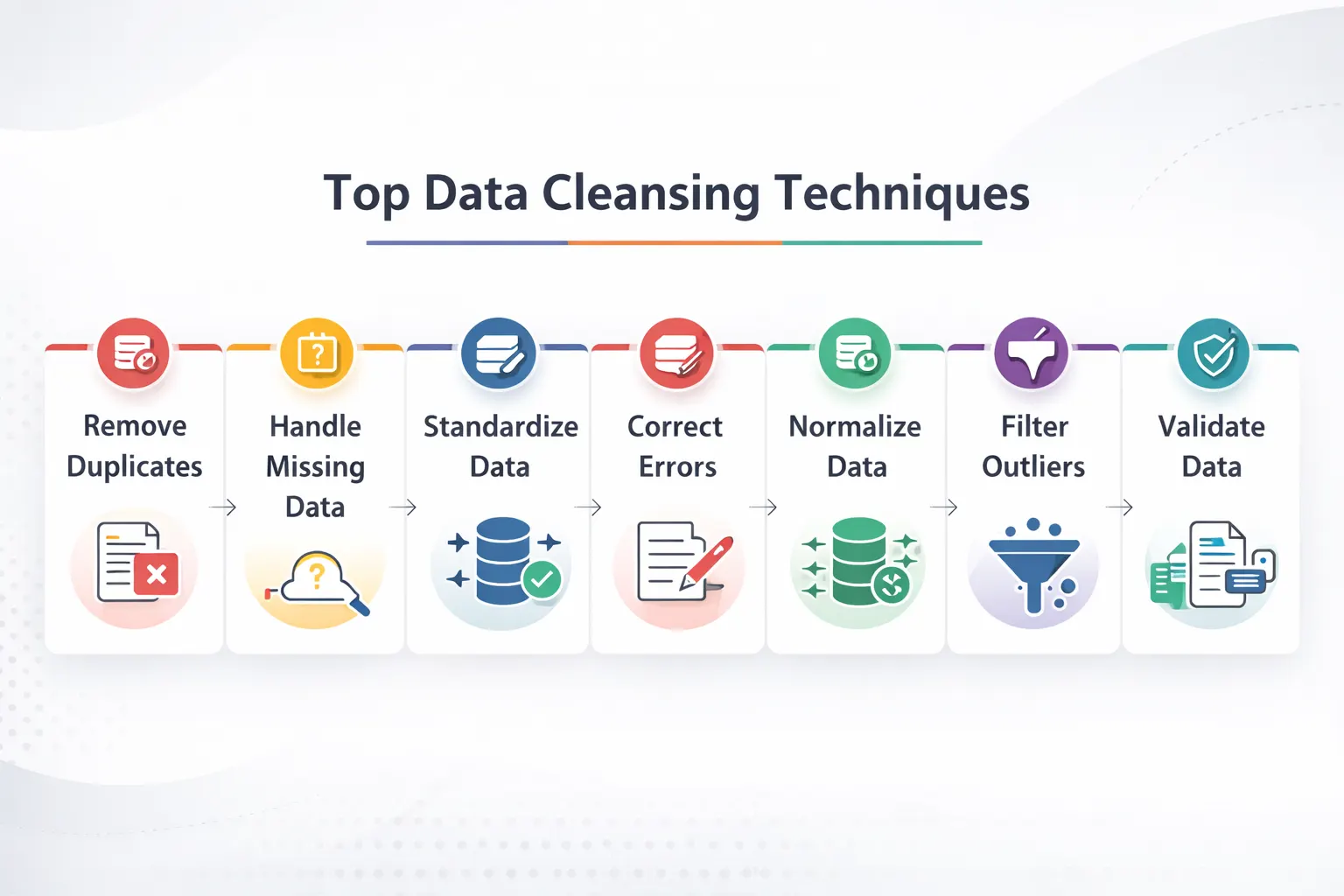
3. Put quality checks in place
Data quality rules help catch problems before they spread. Common checks include completeness, accuracy, freshness, validity, and duplicate detection.
This is where a data-cleansing tool can support scalable data management. When data arrives from multiple systems or user inputs, small errors can multiply quickly. A simple validation rule at intake can stop duplicate records, broken formats, or incomplete fields from affecting downstream analysis.
4. Control access by role
Not every user should see every field. Access tiers help protect sensitive information while keeping the right people productive.
This matters most when the same data environment serves finance, HR, marketing, and analytics teams. Role-based access keeps sensitive information contained without forcing everyone to work around the system.
5. Automate policy enforcement
Manual governance does not scale well. As data volume and team activity increase, policies need to be enforced automatically wherever possible.
That includes schema validation, retention rules, approval workflows, and audit logging. Automation is one of the most practical data governance strategies because it makes policy consistent across systems. It also reduces the chance that a process depends on memory, inbox follow-ups, or ad hoc review.
6. Track lineage end to end
Lineage shows where data came from, how it changed, and where it is used. That visibility becomes extremely useful when a report looks wrong, and the team needs to find the source quickly.
If a revenue dashboard changes unexpectedly, lineage can show whether the issue started in ingestion, transformation, or a source system update. It also supports data integrity techniques during migration, when preserving meaning across systems matters as much as moving the records themselves.
7. Review governance regularly
Governance should evolve with the business. A policy that worked when the team was small may create friction once data volumes grow or new systems are added.
Review ownership, definitions, access rules, and quality metrics on a regular schedule. Quarterly reviews work well for many teams because they surface issues early and keep governance aligned with current operations.
Use cases for governance
| Use case | Governance focus | Business result |
| Executive reporting | Standard definitions and lineage | More trustworthy KPIs |
| Cloud migration | Integrity and automation | Fewer broken dependencies |
| AI model training | Quality and access control | Better inputs and lower risk |
| Compliance audits | Ownership and policy records | Faster evidence collection |
These use cases show why governance is not just a back-office concern. It supports day-to-day decisions, technical delivery, and long-term risk management at the same time.
When to use each strategy
- Use ownership when no one is clearly responsible for a dataset.
- Use standard definitions when different teams report different numbers.
- Use quality checks when data comes from multiple sources.
- Use role-based access when sensitive fields are widely shared.
- Use automation when manual policy checks slow the team down.
- Use lineage when troubleshooting takes too long.
- Use regular reviews when the stack keeps changing.
 Building a stronger program
The best governance programs start with the data that matters most to the business. That usually means revenue, compliance, customer, or executive reporting data, because those areas show the value of governance quickly.
From there, the framework can expand across other domains and teams. If the organization needs help turning policy into practice, data governance consulting can provide a faster route to a working structure.
FAQs
1. What are the best data governance strategies for scalable data management?
The best data governance strategies for scalable data management include clear ownership, standardized definitions, quality checks, role-based access, automation, lineage tracking, and regular reviews. These practices help teams keep data consistent as systems, users, and workflows grow.
2. Why is data governance important for growing businesses?
Data governance is important for growing businesses because it keeps data accurate, consistent, and usable across teams. Without it, reports can conflict, access can become messy, and decision-making slows down.
3. What is an enterprise data governance plan?
An enterprise data governance plan is a structured framework that defines how data is owned, accessed, maintained, and protected across an organization. It gives teams a common way to manage data as the business scales.
4. How do data governance standards improve data quality?
Data governance standards improve data quality by setting rules for accuracy, completeness, freshness, and consistency. They also make it easier to catch errors early and prevent bad data from spreading through reports and workflows.
5. What is data governance for big data?
Data governance for big data is the process of managing large, fast-moving, and complex datasets with clear policies, controls, and oversight. It helps organizations keep data secure, trustworthy, and usable even as volume and variety increase.
6. Do data governance strategies help with cloud migration?
Yes, data governance strategies help with cloud migration by preserving data integrity, tracking lineage, and enforcing policies during the move. This reduces the risk of broken reports, lost context, or inconsistent records after migration.