

Categories
Blog Data Visualization

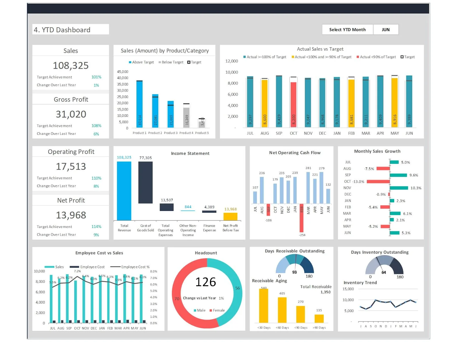
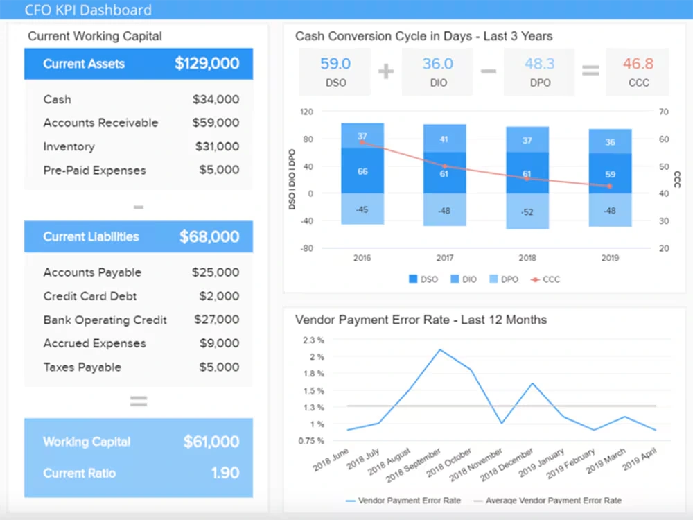
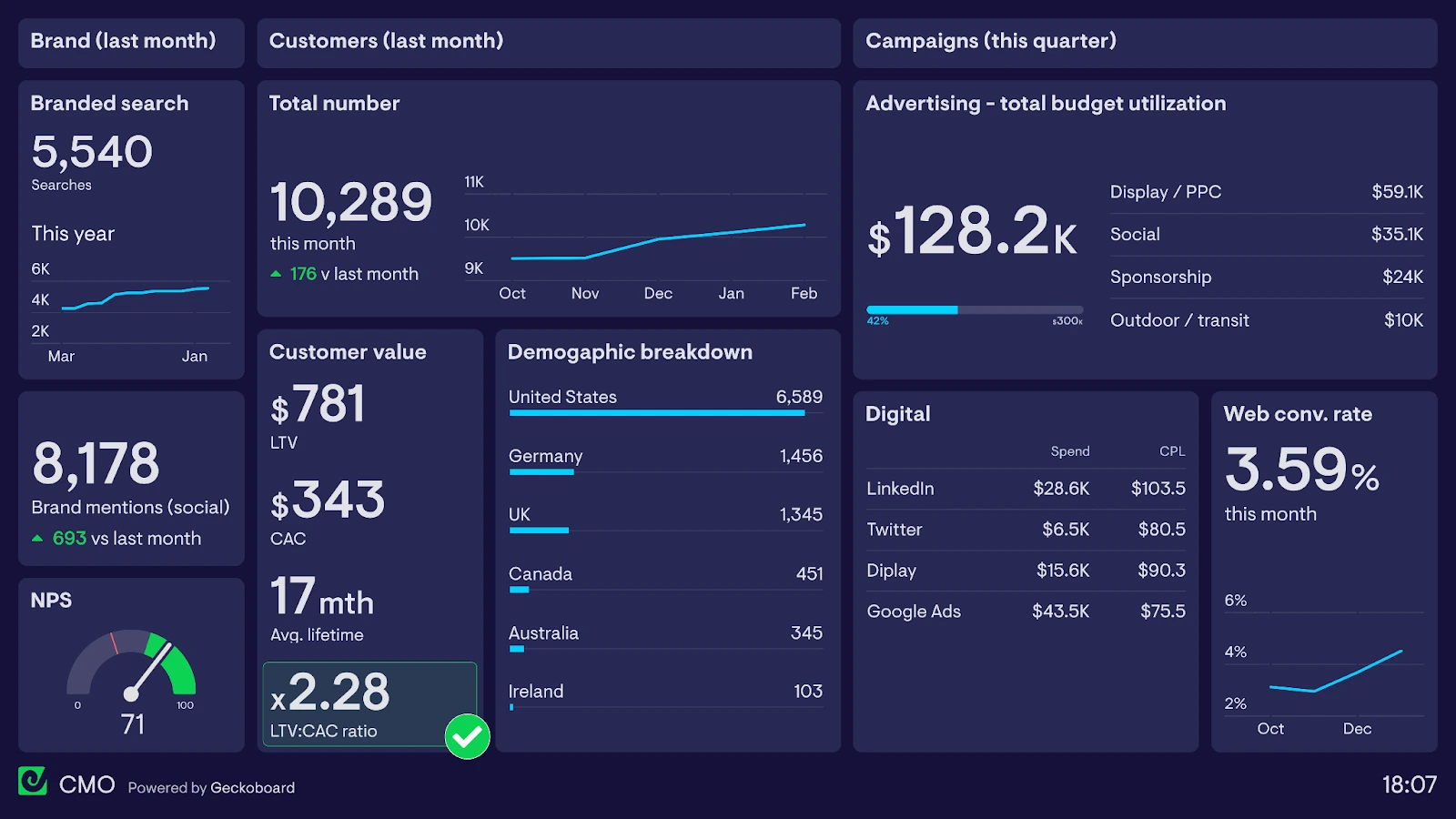
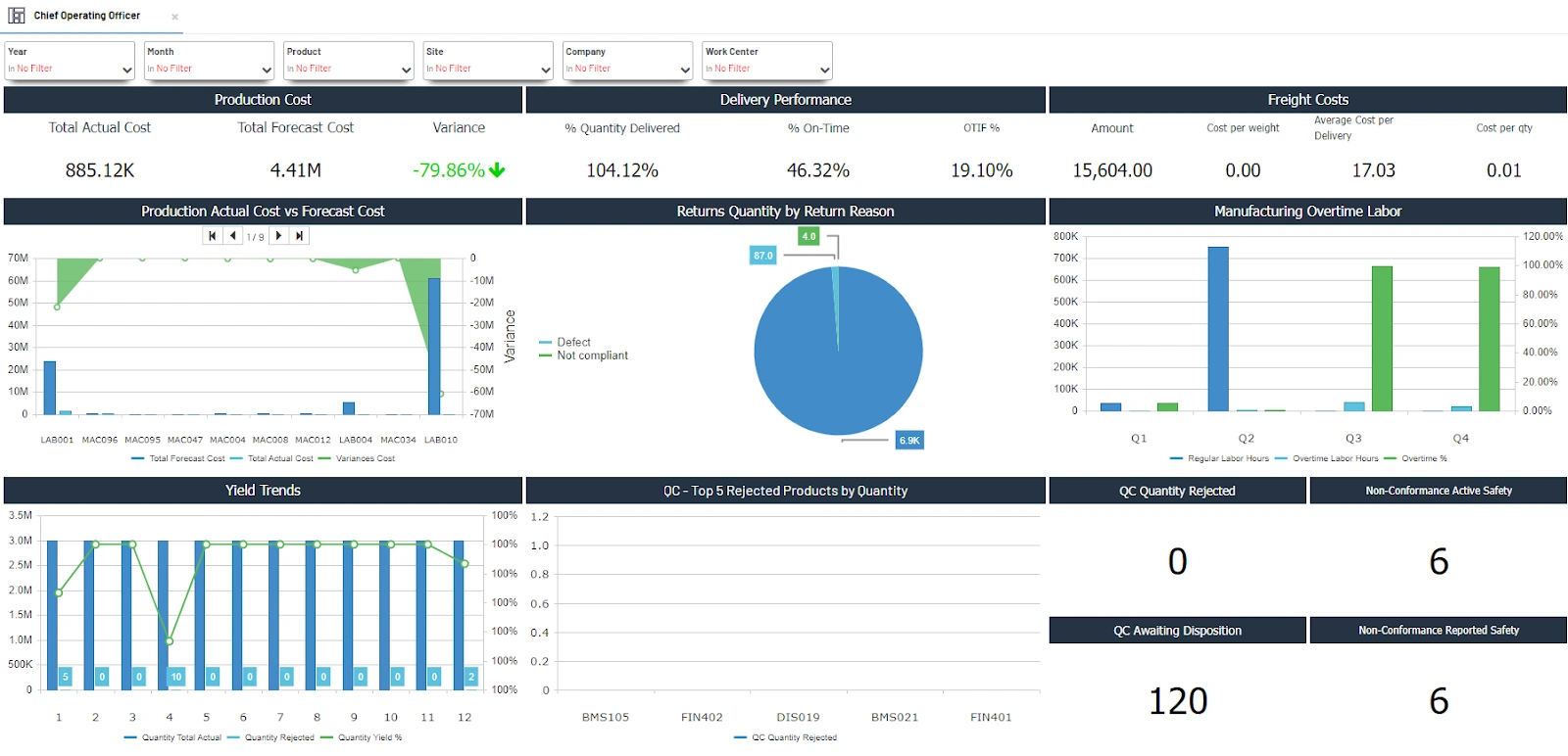
11 Best Tableau Alternatives for 2026

Tableau is one of the most popular business intelligence and data visualization tools on the market. But it asks you to pay between $70 (for individual users) and $165,000 (for enterprise licenses)!

And even if you’re willing to break the bank for Tableau, you still get hit with:

  • A steep learning curve for complex operations.
  • No native scheduling capabilities.
  • Minimal data cleaning and processing options.

Plus, if you need to visualize or process million+ rows, you may experience performance issues, especially if you’re using a live connection!

Thankfully, there are several great Tableau alternatives on the market that offer better data visualization and BI functionality at more affordable prices.

In this blog, I’m going to walk you through 11 such Tableau competitors. We’ll cover everything from the best open source tools to the ones recommended especially by data visualization consultants.

Let’s dive in!

Tableau Alternatives: Table of Contents

  • TL;DR: Which Tableau Alternative is the Best?
  • Tableau Alternatives: Table of Comparison
  • 11 Best Tableau Alternatives for 2026
  • Which Tableau Alternative is Right for You?
  • Tableau Alternatives: FAQs

TL;DR: Which Tableau Alternative is the Best?

While different Tableau alternatives have their own strengths and limitations, I’ve described all 11 Tableau alternatives that work for different use cases. Find out which one aligns with your requirements:

  • Best Enterprise-Grade Alternative: MicroStrategy (Strategy), which offers row-level security, AI-driven insights, and Bitcoin treasury integration for large-scale deployments.
  • Best Free Alternative: Helical Insight, an open-source tool with pixel-perfect reporting and workflow automation, ideal for budget-conscious teams.
  • Best for Embedding: Sisense, powered by ElastiCube engine and SDKs, which enable seamless white-label dashboards in apps.
  • Best AI-Powered Alternative: ThoughtSpot, backed by Natural language search (SpotIQ) and autonomous AI analytics for non-technical users.
  • Best for Microsoft Ecosystems: Power BI, which costs just $10/user/month, and comes with deep Excel/Azure integration + Copilot AI.
  • Best for Ad-Hoc Exploration: Qlik Sense with its associative engine that uncovers hidden data relationships without predefined queries.
  • Best for Real-Time Analytics: Domo, with 5-minute auto-refresh cycles and 1,000+ connectors for live dashboards.
  • Best for SQL-Centric Teams: Looker, backed by LookML semantic layer, which ensures metric consistency across Google Cloud workflows.
  • Best for Developers: Apache Superset, a free, SQL-first, and customizable Tableau alternative with 40+ visualization types.
  • Best for SMBs: Zoho Analytics, which costs $24/month, and comes with an AI assistant “Ask Zia,” along with 500+ integrations.
  • Best Lightweight AlternativeMetabase, a self-hosted or cloud Tableau alternative, with no-code queries, and a simple, 5-minute setup.

Tableau Alternatives: Table of Comparison

In a hurry? I’ve got you covered!

Check out this table of comparison of the 3 best Tableau alternatives on the market.

Metric

Power BI

Looker

Domo

Primary Use Case

Self-service BI, Microsoft ecosystem integration

Governed analytics, embedded BI

Real-time dashboards, embedded analytics

Best For

SMBs to enterprises, Excel/Azure users

SQL-savvy teams, Google Cloud users

Non-technical users, mobile-first workflows

Data Connectors

500+ (including Excel, SQL, Azure)

60+ (strong Google Cloud focus)

1,000+ (broadest range)

AI/ML Capabilities

Copilot (NLP, auto-insights), AutoML

Gemini AI (NLP, auto-modeling)

Domo.AI (chat-based insights, AutoML)

Data Modeling

Power Query, DAX

LookML (SQL-based semantic layer)

Magic ETL (drag-and-drop), SQL dataflows

Visualizations

30+ built-in, custom R/Python visuals

Limited customization (LookML-dependent)

150+ charts, 7,000+ custom maps

Embedded Analytics

Basic (iFrames, APIs)

Strong (APIs, white-labeling)

Best-in-class (Domo Everywhere SDK)

Real-Time Data

Limited (requires Premium)

Direct querying (no extracts)

5-minute refresh cycles

Mobile Support

iOS/Android apps

Limited mobile optimization

Best mobile app (CEO-friendly)

Collaboration

Teams integration, comments

Looker Studio integration

Domo Buzz (in-app chat)

Pricing

– Free tier

– Pro: $10/user/month

– Premium: $20/user/month

Custom quotes (~$60K+/year)

Credit-based (~$20K–$100K+/year)

Scalability

Good (up to 100M rows)

Excellent (petabyte-scale)

Excellent (100B+ rows/day)


1 1 Best Tableau Alternatives for 2026

Here’s my list of the best Tableau alternatives, including the top data visualization tools and business intelligence tools on the market:

1. Microsoft Power BI

Best For: SMBs that need a scalable platform and are already using other Microsoft products.

First on my list is Microsoft’s native data visualization platform – Power BI. It also doubles up as a data visualization tool like Tableau.

It offers a wide range of features such as interactive dashboards, AI-driven insights, and integration with several data sources.

Standout Features of Power BI

  • Real-Time Dashboards: Power BI’s dashboards can help you live-stream data from 500+ sources. The dashboards also auto-refresh to give you the latest data. 
  • Excel Integration: You can directly import and export data between Microsoft Power BI and Excel through the PivotTable functionality. 
  • AI Analytics: Microsoft has integrated Copilot with Power BI, which means you can use it to raise text-based queries and get data insights in return!

Also Read: How to Use Power BI Like a Pro?

Pros of Power BI

  • Affordable pricing plans.
  • Very smooth integration with other Microsoft products.
  • Good mobile support through a dedicated app.

Cons of Power BI

  • Steep learning curve for complex queries.
  • Limited customization for visuals. 

Power BI Pricing

  • Pro: $14/user/month
  • Premium: $24/user/month
  • Fabric: Custom pricing for enterprise needs.

2. Qlik Sense

Best For: Teams in data-heavy industries that need ad-hoc explorations without predefined queries.

Qlik Sense is an AI-powered, enterprise-grade Tableau alternative.

What makes it special is its unique associative engine that empowers dynamic data collaboration, real-time insights, and predictive analytics.

Let me show you why it can be an excellent alternative to Tableau.

Why Qlik Sense is a Good Power BI Alternative

  • Associative Engine: Qlik Sense doesn’t restrict you to predefined queries or hierarchies, so you can create and define relationships between data points based on your requirements.
  • AI Analytics: Qlik’s native Insight Advisor provides you with context-aware analytics, which is more advanced than Tableau’s Ask Data, which lacks context-awareness.
  • Real-Time Action: You can get automated alerts in real-time directly to your preferred workflow apps like Slack. 

Pros of Qlik Sense

  • Very quick performance with an in-memory engine.
  • Offers very good embedding and white-label capabilities.
  • Particularly useful for AI or ML applications.

Cons of Qlik Sense

  • Might be expensive for small teams or startups.
  • Very steep learning curve for non-technical users.
  • Some features (like predictive analytics) are only available with the most expensive plan.

Also Read: Tableau vs. Qlik Sense: Which One Should You Choose for Data Visualization?

Qlik Sense Pricing Plans

  • Starter: $200/month.
  • Standard: $825/month.
  • Premium: $2,750/month.

3. Looker (Google Cloud)

Best For: Teams that rely heavily on SQL databases and querying systems or Google Cloud users who are already using BigQuery.

Looker is a modeling-centric business intelligence tool like Tableau.

It is powered by LookML, an SQL-based semantic layer. It was acquired by Google and now integrates well with all other Google products, including Cloud and BigQuery.

It can be a great Tableau alternative if you’re looking for advanced governed analytics and embedded dashboard capabilities.

Why Looker is a Good Power BI Alternative

  • Semantic Layer: LookML enforces strict data standardization, ensuring that you get consistent metrics across all reports. 
  • Real-Time BigQuery Integration: Looker runs queries directly from BigQuery in real time. More importantly, it can do so without any time-consuming extractions, unlike Tableau. 
  • Embedded Analytics: Looker’s API-first architecture is perfect for seamless white-labeling and agency requirements. It far outperforms Tableau’s clunkier, more expensive API capabilities.

Pros of Looker

  • Strong row-level security.
  • Single source of truth, unlike Tableau’s decentralized approach.
  • Deep Google Cloud integration. 

Cons of Looker

  • Pricing might be too expensive for SMBs and startups.
  • Minima support for mobile functionality.
  • Limited visualization options.

Looker Pricing Plans

Looker can cost you anywhere between $35,000 and $150,000+ annually, depending on your requirements.

4. Domo

Best For: Mid-sized enterprises that need real-time data monitoring.

Domo makes my list of the best Tableau alternatives as a cloud-native BI platform.

It combines real-time dashboard with AI analytics and expansive integration capabilities with a mobile-first design and ETL tools.

Why Domo is a Good Power BI Alternative

  • Real-Time Data Processing: Domo’s dashboards are designed to automatically refresh every five minutes, outperforming Tableau’s manual or scheduled refreshes.
  • Built-in Collaboration Capabilities: With features like Domo Buzz and annotations, your team can discuss data directly on dashboards without switching to another tool.
  • Magic ETL: You need any SQL knowledge to use Domo’s ETL functions, which is not the case with Tableau. 

Pros of Domo

  • Supports 1,000+ data connectors.
  • Offers a mobile app with offline access.
  • HIPAA and SOC 2 compliant tool.

Cons of Domo

  • Domo can slow down when handling large datasets.
  • Very costly, even when compared to Tableau’s high pricing.
  • Limited advanced visuals.

Domo Pricing Plans

Domo’s pricing plans start at ~$15/user/month and can go up to a minimum $10K/year for small teams.

While its enterprise plans exceed $150K/year, you can also opt for a credit-based model for data volume.

5. Sisense

Best For: Developers that need to embed BI and data visualization features into their SaaS products.

Sisense is an AI-powered, embed-friendly Tableau alternative.

Unlike other data visualization tools, Sisense specializes in data modeling for seamless integration into other applications.

Let me show you why it’s hugely popular with developers around the world:

Why Sisense is a Good Power BI Alternative

  • In-Chip Engine: Sisense gives you access to its proprietary ElastiCube technology, which can easily process real-time queries for datasets with billion+ rows.
  • SDK-Driven Embedding: Sisense is an embed-first platform and works very well with apps and websites powered by Angular, React, and Vue frameworks. 
  • Advanced AI automation: While Sisense comes with automated anomaly detection insights, Tableau requires manual setup for advanced AI features.

Pros of Sisense

  • Extremely fast queries with ElastiCube.
  • SOC 2 and ISO 27001 compliant tool.
  • Supports 400+ data connectors. 

Cons of Sisense

  • Requires knowledge of Compose SDK functionality. 
  • Not very scalable as the costs mount quickly with multi-tenant setups. 

Sisense Pricing Plans

Sense is extremely expensive, with plans starting at ~$40,600/year (Essential tier, 5–15 users).

Its Enterprise plans are even more expensive, exceeding $327,000/year (unlimited ElastiCubes, AI features).

You might also encounter hidden costs like viewer licenses, data connectors, and professional services add 20–30% to base fees.

6. Zoho Analytics

Best For: SMBs that need a cost-effective business intelligence solution.

Zoho Analytics is an AI-powered, self-serve BI tool that integrates with 500+ data connectors and features drag-and-drop visualization capabilities.

It could be your go-to Tableau alternative if you need a user-friendly tool that can be used by non-technical teams.

Why Zoho Analytics is a Good Power BI Alternative

  • Built-in Data Prep: Zoho automatically cleans and processes your data, whereas Tableau requires you to purchase the data cleaning service separately.
  • AI Features: Zoho’s “Ask Zia” can generate reports in response to simple text-based queries. It can even diagnose anomalies and suggest corrective actions. 
  • Embedded Analytics: Zoho’s embedding and white-label capabilities are more seamless as well as more affordable compared to Tableau’s.

Pros of Zoho Analytics

  • Zoho is 50% cheaper compared to Tableau.
  • Comes with pre-built templates for 25+ business apps.
  • Features 500+ connectors.

Zoho Analytics of Looker

  • Slow performance for datasets with 50M+ rows.
  • Comes with fewer advanced visualization capabilities.

Zoho Analytics Pricing Plans

Zoho Analytics is free to use for 2 users and up to 10K rows.

Its paid plans start at $24/month and go up to $575/month for enterprise use-cases.

7. ThoughtSpot

Best For: Non-technical teams that need a Google-like search for their data.

ThoughtSpot is one of the best data visualization tools on the market.

While data visualization consultants use them for enterprise-grade BI requirements, I’ve also seen SaaS developers leverage them for in-app embeds.

It thus makes my list of Tableau competitors as one of the most versatile BI platforms with a wide range of applications.

Why ThoughtSpot is a Good Power BI Alternative

  • NLP Queries: ThoughtSpot features a special tool called SpotIQ, which can generate data-backed answers to text-based queries like, “Why did sales drop in March?”
  • Live Data Exploration: You can get faster, real-time responses from ThoughtSpot compared to Tableau, as the former runs directly on cloud data warehouses like BigQuery.
  • Embedded Analytics: Comes with SDKs and API integration that supports seamless embedding for both agency white-labeling and mobile/web applications.

Pros of ThoughtSpot

  • Doesn’t need you to have any SQL knowledge.
  • Strong row-level security.
  • SOC 2 and HIPAA compliant tool.

Cons of ThoughtSpot

  • Limited visualization options.
  • Expensive embedding pricing ($5/dashboard).
  • Complex setup for data modeling.

ThoughtSpot Pricing Plans

ThoughtSpot offers different plans for analytics and embedding.

Analytics plans start at $50/user/month for 5M rows and 5 users.

Embedded Plans come with consumption-based pricing ($$$/query). I’ve also heard that ThoughtSpot’s costs are unpredictable for heavy usage.

8. Apache Superset

Best For: Startups and SMBs that need an open-source, scalable BI platform.

Apache Superset is the only open-source Tableau alternative on my list.

It’s not just free, it’s also extremely lightweight, making it a top choice among developers and data visualization consultants that are familiar with SQL.

Why Apache Superset is a Good Power BI Alternative

  • Flexibility: Superset is 100% free and still allows unlimited customization, including custom visualizations plugins with JavaScript.
  • SQL Workflow: Superset’s SQL Lab IDE enables complex joins, templating, and query optimization, making it ideal for data engineers. 
  • Scalable: You can easily scale your BI functionality with Superset’s cloud-native architecture that requires zero data ingestion.

Pros of Apache Superset

  • Zero licensing costs. 
  • 40+ data visualization options.
  • Direct querying without any extracts. 

Cons of Apache Superset

  • Steep setup that requires technical knowledge. 
  • Very weak mobile experience. 

Apache Superset Pricing Plans

While Apache Superset is completely free if self-hosted, you can also opt for its managed hosting service, which is free for up to 5 users and then costs $20/user/month.

9. MicroStrategy

Best For: Enterprises that require centralized data governance and compliance.

Strategy, formerly called MicroStrategy is an AI + BI platform that brings together advanced analytics, AI-driven insights, and Bitcoin treasury management.

It makes my list of Tableau alternatives as an enterprise-grade BI tool with limited but robust data visualization capabilities.

Why MicroStrategy is a Good Power BI Alternative

  • Semantic Graphs: MicroStrategy’s Semantic Graphs enforces strict business rules that you can define to deliver consistent results across reports.
  • HyperIntelligence: It delivers contextual insights directly to apps like Outlook or CRMs like Salesforce.
  • Enterprise-Grade Scalability: Works seamlessly with pentabyte-scale datasets with in-memory support and multi-tenancy support. 

Pros of MicroStrategy

  • Completely centralized governance for your data. 
  • Offers predictive analytics and support for text-based queries. 
  • Enterprise grade security with SOC 2 and HIPAA compliance.

Cons of MicroStrategy

  • Very high costs, even compared to Tableau’s expensive pricing.
  • Less visualization options compared to Tableau.
  • Steep learning curve. 

MicroStrategy Pricing Plans

While MicroStrategy only offers custom pricing, the data visualization consultants I’ve worked with report that the Starter plan costs ~$35,000/year (small teams) and Enterprise plans cost up to $150,000+/year (unlimited users, AI features).

Also Read: Tableau vs MicroStrategy – Which Data Visualization Tool is Better?

10. Metabase

Best For: Non-technical teams and users who need a BI tool with a drag-and-drop interface.

Metabase is another open-source, lightweight Tableau alternative.

It’s designed primarily for self-service analytics and comes with decent no-code querying and interactive dashboards.

Why Metabase is a Good Power BI Alternative

  • No-Code Architecture: Regardless of how complex your query is, you don’t need any SQL knowledge to build queries in Metabase.
  • Cost Efficient: While Metabase is completely free to use for low-level capabilities, even its pro plan costs just $85 compared to Tableau’s $850.
  • Embed Analytics: Metabase’s pro plan comes with smooth white-labeling capabilities and interactive embedding via API or SDKs.

Pros of Metabase

  • Easy setup and can be deployed in minutes.
  • Backed by strong community support.
  • Sends alerts directly to apps like Slack.

Cons of Metabase

  • Slows down when working with datasets containing 50M+ rows.
  • Limited advanced visualization options. 

Metabase Pricing Plans

  • Open Source: Free (self-hosted).
  • Starter: $85/month (5 users + $5/user extra).
  • Pro: $500/month (10 users + $10/user extra).
  • Enterprise: Custom (starts at ~$15K/year).

11. Helical Insight

Best For: Enterprises that need to create highly compliant reports or developers that need API customization.

Last on my list of Tableau alternatives is Helical Insight.

It’s an open-source but enterprise-grade BI platform that offers pixel-perfect reporting, embedded analytics, and workflow automation.

Why Helical Insight is a Good Power BI Alternative

  • Canned Reporting: Generates document-style reports that you can print, making Helical especially suited to enterprises that need to generate compliance reports.
  • Workflow Automation: Helical Insight automates report bursting, scheduling, and alerts; Tableau only offers this feature through third-party integrations. 
  • Flat Pricing: Helical Insight’s Community Version is free to use, while even the paid versions don’t charge you per user.

Pros of Helical Insight

  • White-label embedding supports full rebranding.
  • Offers unified metrics even across databases.
  • Provides direct support for developers.

Cons of Helical Insight

  • The setup is complex and requires DevOps or IT support.
  • Supports fewer native visualization options compared to Tableau.

Helical Insight Pricing Plans

  • Community Edition: Free (self-hosted).
  • Enterprise: Custom flat pricing (~$35K/year for core features)

Which Tableau Alternative is Right for You?

In this blog, I’ve walked you through the 11 best Tableau alternatives and competitors on the market.

So, which one is right for your business intelligence and data visualization requirements?
As a veteran data visualization consultant, my answer is that the best tool depends on your use case and budget, and whether you want a tech-savvy or user-friendly solution.

For tech-savvy users, I recommend going with Domo or MicroStrategy. They’re also good for enterprise use cases.

For users that want good visualization options with user-friendly interfaces, I suggest giving Looker, PowerBI and Zoho a shot. They’re relatively easy to use and come with decent support.

And if you want to find out which of the best data visualization tools we’ve discussed above suit your use-case with extreme precision, why not connect with us?At Augmented Systems, we specialize in helping growing startups, thriving SMEs, and established enterprises find the best solutions for their data visualization needs.

Reach out to us, tell us about your requirements, and let us do the heavy lifting so you can focus on the thing that matters: making smarter decisions with data-backed insights.

Tableau Alternatives: FAQs

1. Which Tableau alternative is best for small businesses?

Zoho Analytics ($24/month) or Power BI ($10/user/month) are ideal for SMBs. Both offer affordability, ease of use, and solid integrations—Zoho for AI automation, and Power BI for Microsoft ecosystem users.

2. What’s the best free alternative to Tableau?

Helical Insight (open-source) or Apache Superset (free, SQL-friendly). Helical excels in compliance-ready reports, while Superset is perfect for developers needing customization.

3. Which tool beats Tableau in real-time analytics?

Domo wins with 5-minute refreshes and 1,000+ connectors. Perfect for live dashboards, though it’s pricier than Tableau.

4. Is there a Tableau alternative with better AI features?

ThoughtSpot (NLP search) and Power BI (Copilot AI) lead here. ThoughtSpot answers plain-English questions; Power BI integrates AI seamlessly with Excel/Azure.

5. Which alternative is best for embedding analytics?

Sisense (ElastiCube engine) or Looker (LookML APIs). Sisense offers SDKs for devs; Looker ensures metric consistency in embedded dashboards.


Categories
Blog Data Visualization

How to Use Power BI with Excel?

“Is there any way to make Excel analysis go faster?”

That’s a question I’ve heard too many times as a data visualization consultant.

The good news is that it’s a problem you can solve easily by combining the strengths of Excel with the capabilities of Power BI, Microsoft’s native data analysis tool.

Whether you’re an analyst who needs to analyze datasets with million+ rows, a fintech executive who needs real-time analysis, or an IT manager concerned about Excel’s lack of security, the Excel Power BI integration is what you need!

In this blog, I’m going to show you how you can leverage Power BI Excel connectors to analyze huge datasets and securely share insights with team members.

Here’s what I’ll cover:

  • 3 proven methods to connect Power BI with Excel (including free options).
  • When to use each tool: avoid “Excel hell” and “Power BI overkill.”
  • Best practices that I stand by as a data visualization consultant.

Let’s dive in!

How to Use Power BI with Excel: Table of Contents

  • What is Power BI?
  • Advantages of Using Power BI with Excel
  • How to Connect Power BI with Excel?
  • How to Use Power BI with Excel?
  • How to Use Power BI with Excel: Best Practices
  • You’re Ready to Maximize the Combination of Power BI with Excel
  • How to Use Power BI with Excel: FAQs

What is Power BI?

Power BI is Microsoft’s native business intelligence and data visualization tool.

Its core strength and function is to take raw data from different sources and convert it into user-friendly reports. You can use it to break down data into stories, discover hot trends behind cold numbers, and make smarter, data-driven decisions.

Let me briefly show you the features that Power BI offers.

Features of Power BI

  • Connects with multiple data sources, including Microsoft Excel.
  • Optimized to work with millions of rows of data.
  • Lets you clean, model, and analyze data using Power Query and DAX queries.
  • Offers multiple data visualization options, including charts, graphs, and maps. 
  • Power BI Service helps you securely share insights with your team.

As you can see, Power BI offers a lot of enterprise-grade features that can empower you to get actionable insights from large data sets. Thus, Power BI compensates for one of Excel’s main limitations.

Also Read: Top 9 Features of Power BI You Need to Know in 2026

Advantages of Using Power BI with Excel

There are 7 main advantages that you can gain by using Excel Power BI dashboards. These include:
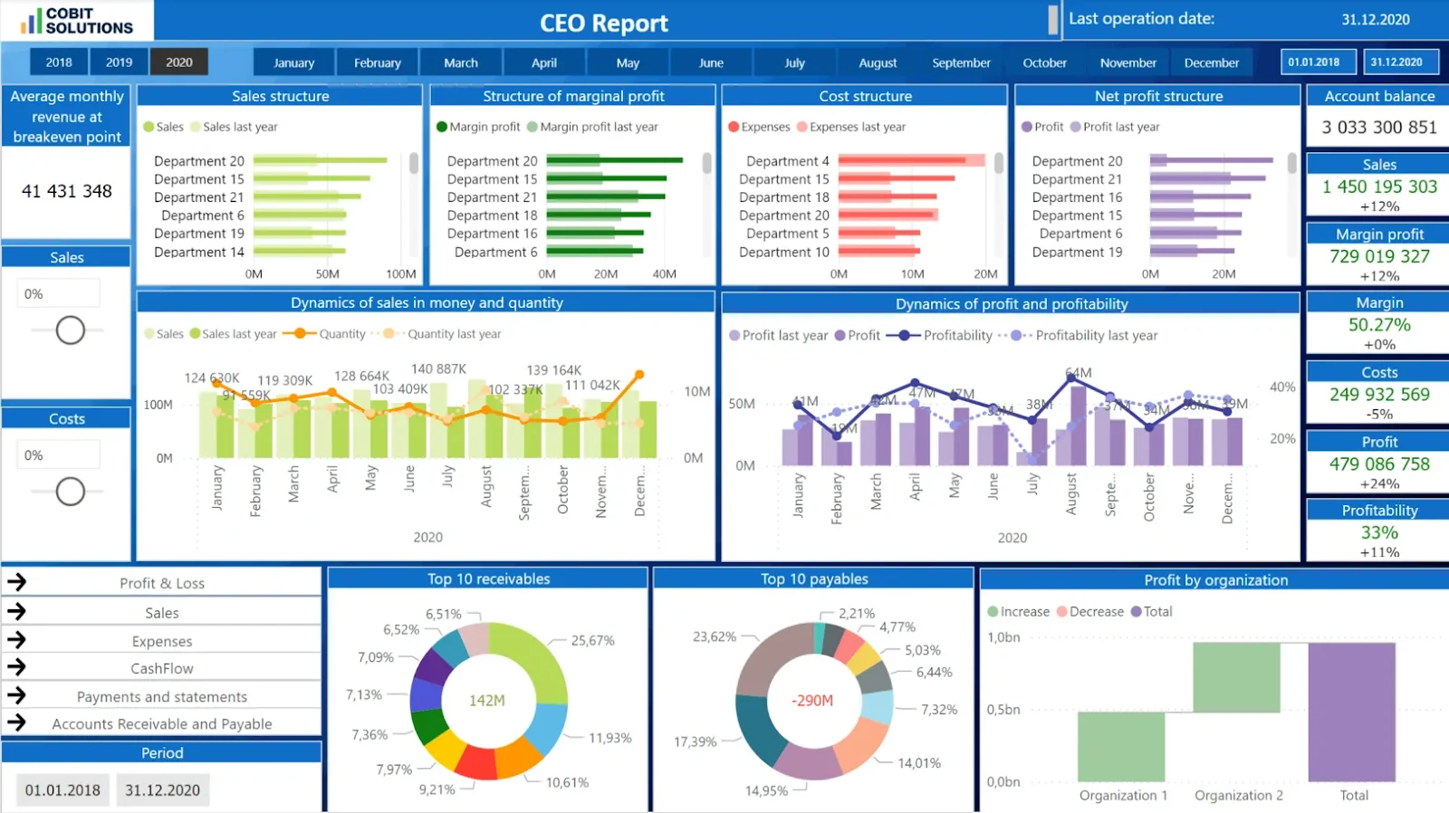
1. Familiarity and Flexibility with Data Modeling

A majority of the analysts and executives start their journey into the world of data with Excel.

In fact, even with the rise of other databases and dataset viewers, Excel remains the universal favorite when it comes to running quick calculations, financial modeling, and ad-hoc analysis.

But using Excel alone might be limiting as its performance lags with large datasets.

Whereas, when you combine its powerful capabilities with the ease & scalability of Power BI, you can get more benefits than just using Excel and flexibility to switch between the two platforms.

In fact, I’ve seen many data visualization consultants switch between the two platforms depending on their requirements!

2. Granular Data Manipulation

Another benefit of using Excel is that you can manually edit individual cells, apply custom formulas, and tweak them whenever you want.

Simply put, it’s great for small and medium databases of less than 1 million rows.

So, you can use it to analyze specific datasets with limited rows or data points, and switch to Power BI for analyizing larger datasets.

3. Offline Accessibility

One of the best parts about Excel is that you only need computing power to use it.

This means you can access your data regardless of whether you’re connected to the internet.

Its offline accessibility thus makes Excel an invaluable tool in your arsenal!

4. Handles Massive Datasets

If you’ve Excel sheets with millions and billions of rows without the computing power or Excel features to process them, Power BI is the tool you need.

It’ll integrate perfectly with Excel and eliminate performance lags with optimized compression and powerful cloud computing.

5. Interactive, Dynamic Visualizations

While Excel offers 25+ data visualization types, Power BI offers nearly double this number, with 45+ options. This includes Sankey diagrams, AI-powered charts, and more.

Plus, Power BI gives you features like Drill Down, Cross-Filtering, and Tooltips you can use to gain deeper insights into your data.

Pro Tip: Data visualization services like Augmented’s can help you leverage the complete capabilities of powerful tools like Power BI while eliminating the time required to master its features. 

6. Real-Time Collaboration

If you’re working with sensitive financial, healthcare, or customer data and need a data visualization tool that also guarantees safety, you can benefit from using both Power BI and Excel.

You can collect, store, and organize data in Excel sheets while sharing insights and analysis directly through Power BI Service.

It’ll eliminate the need to email sensitive data to users within or outside your organization, while Power BI Excel connectors will ensure that your insights stay fresh.

7. Advanced AI and Natural Language Querying

Lastly, if your team consists of both technical and non-technical users, you should definitely consider using both Excel and Power BI to get the best of both worlds.

That’s because Power BI comes with advanced AI that lets you create reports through simple, text-based queries.

So, you can just ask it to “Create a Report on the Sales in the North American region for Q1 of this year,” and it’ll automatically generate the report for you!

Also Read: Power BI vs. Excel: Which is Better for Data Visualization?

Power BI & Excel Connectors: How to Integrate Them Together?

There are three ways you can connect Power BI with Excel. Let me quickly walk you through all three of them:

Method 1: Import Excel Data into Power BI

Under this method, you’re basically uploading Excel data to Power BI to analyze it visually. Here’s the process you need to follow:

  • Open Power BI Desktop → Select “Get Data” → Choose Excel.
  • Browse and select your Excel file.
  • Use Power Query Editor to clean and transform data (you can change data types, filter rows & more).
  • Click “Close & Apply” to load data into Power BI.

Method 2: Analyze Power BI Data in Excel (Analyze in Excel Feature)

Under the second method, you’re doing the opposite: using Power BI to create an Excel sheet where you can analyze the data.

Follow this three-step-process for to create your Excel file:

  • In Power BI Service, open a report → Click “Analyze in Excel”.
  • The system generates an Excel file with a live connection to the Power BI dataset.
  • Use PivotTables, charts, and Excel formulas to analyze the data.

Note: You’ll need a Premium or Pro subscription to both create and view the report to use this method.

Method 3: Export Power BI Data to Excel

You can also manually export data through a refreshable Excel table. Here’s what you need to do:

  • In a Power BI report, click “Export Data” (…) on a visual.
  • Choose “Summarized Data (.xlsx)” for a refreshable Excel table.
  • Open the file in Excel → “Enable Editing” to interact with live data.

How to Use Power BI with Excel?

Now, we get to the main question: how can you use Power BI with Excel to leverage the best features of both tools? Let’s find out:

1. Create Power BI Reports from Excel Data

The first way to use Power BI with Excel is to prepare your data in an Excel sheet and upload it to Power BI for analysis.

Here’s how you can do it:

Process

Step One: Prepare Excel Data

Format as a Table (Ctrl+T) and clean data (remove blanks, standardize formats)

Step Two: Import into Power BI Desktop

Go to “Get Data” → Excel → Select file → Transform in Power Query if needed.

Step Three: Build Visualizations

Drag-and-drop fields to create charts, tables, or maps.

Step Four: Publish to Power BI Service (Optional)

Share dashboards with teams via the cloud.Who Should Use This Method?

This method is ideal for:

  • Excel power users transitioning to BI tools.
  • Small businesses which need basic dashboards without complex setups.

Ideal Use Case

  • Turning monthly sales reports (Excel) into interactive Power BI dashboards.

Will You Need a License to Use This Method?

No, since Power BI Desktop is free (but doesn’t offer sharing capabilities), you won’t need a license to integrate Power BI and Excel by using this method.

However, you’ll need a Pro/Premium required to publish reports to Power BI Service.

2. Use “Analyze in Excel” to Explore Power BI Datasets

The second method, using the “Analyze in Excel” feature to explore Power BI datasets, is very useful for anyone who is used to Excel but needs to process large amounts of data.

Here’s the process you need to follow:

  • Step 1: Go to Power BI Service, open a report → Click “Analyze in Excel”.
  • Step 2: Open the downloaded .odc file in Excel.
  • Step 3: Use PivotTables, Formulas, or Charts with live-connected data.

Who Should Use This Method?

The “Analyze in Excel” method is ideal for:

  • Business analysts who prefer Excel’s flexibility but need enterprise data.
  • Finance teams doing ad-hoc analysis on centralized datasets.

Ideal Use Case:

  • A CFO reviewing Power BI financial data in Excel for custom variance analysis.

Will You Need a License to Use This Method?

Yes, you’ll need Power BI Pro/Premium (for both the report creator and viewer) to use this method. This is because it requires Power BI Service, which is not included in the free plan.

3. Exporting Power BI Data to Excel for Further Analysis

If you want to use your Power BI data in a raw format for customized modeling, you can use this method. It’ll help you export Power BI data to Excel for analysis.

To do so, follow this simple two-step process: 

  • Step 1: In a Power BI report, click “Export Data” on a visual.
  • Step 2: Choose between: 

    – Summarized Data: Static snapshot (free).

    – Underlying Data: Refreshable table (Pro/Premium).

Who Should Use This Method?

The “export to Excel” method is ideal for: 

  • Data scientists who need raw data for advanced modeling.
  • Teams without Power BI access who rely on Excel.

Ideal Use Case:

  • Exporting customer segmentation data from Power BI to Excel for statistical analysis.

Will You Need a License to Use This Method?

You can use this method for free if you only want to export the summarized report. However, you’ll need a Pro/Premium licnese to export the underlying data.

How to Use Power BI with Excel: 5 Best Practices

1. Optimize Data Structure

To optimize your data structure, use Excel Tables instead of ranges.

Here’s how it can help you:

  • Tables (Ctrl+T) maintain structured references, preventing errors when data expands.
  • Power BI recognizes tables as single entities, making refresh operations more reliable.

Following this practice will ensure that you never suffer from broken connections when adding new rows/columns to your Excel source files!

2. Leverage Power Query for Data Cleaning

Always remember to clean your data to remove duplicates, fix errors, and standardize formats before importing.

Here’s why this is important:

  • Power Query’s non-destructive editing preserves raw data while creating clean outputs.
  • Transformations apply automatically during refreshes (unlike manual Excel cleaning).

So, if you invest your time in cleaning your data, you can save hours of repetitive work and maintain consistent data quality across reports.

3. Use Power BI for Dashboards, Excel for Ad-Hoc Analysis

Here’s a general rule that data visualization consultants follow:

  • They use Power BI for creating enterprise-grade reports.
  • They leverage Excel to perform custom calculations and run what-if scenarios.

This is because:

  • Excel’s formula flexibility is perfect for one-off calculations and sensitivity analysis.
  • Power BI handles large datasets and real-time updates better than Excel.

In other words, by using the right tool for the right exercise, you can prevent crashes with big data while retaining analytical versatility.

4. Schedule Automatic Refreshes

Another way to benefit from Power BI Excel integration is to set up scheduled refreshes in Power BI Service for real-time insights.

Here’s why:

  • You might get outdated insights into your data if you rely exclusively on manual updates (e.g., stale inventory numbers).
  • Plus, Premium licenses allow up to 48 refreshes/day (vs. 8 with Pro).

So, you can benefit from leveraging scheduled/automated refreshes without manual intervention. This can be especially critical for your ops/finance teams. It’ll give them real-time updates and information whenever they need them!

5. Apply Row-Level Security (RLS)

Lastly, you should use Power BI’s security features to restrict data access to specific users.

I primarily recommend this practice because Excel lacks native security, so anyone with file access will be able to see all the data within it.

That’s where Power BI RLS restricts data visibility by user role (e.g., regional managers see only their territory).

This way, you can safely share reports without exposing confidential information while also eliminating the need to share them via email or other potentially unsafe communication channels.

You’re Ready to Maximize the Combination of Power BI with Excel

Power BI and Excel are great data visualization tools. However, both of them come with their own limitations. While it’s harder to perform data modeling and custom calculations with Power BI, Excel’s performance lags can be a serious problem for anyone handling million+ rows.

That’s why I highly recommend using them together: this way, they’ll compensate for each other’s limitations and empower you to enjoy the best of their capabilities.

However, you might not be an expert in both Power BI and Excel.

That’s where we come in!

At Augmented Systems, we specialize in helping you leverage the best of both worlds by bridging your knowledge gap with our technical expertise.

We’ve had great success in helping several clients combine their Power BI and Excel workshops into one smooth operation. So, whether you need more speed, security or sophisticated analysis, we offer data visualization services that suit all use cases.

Connect with our data visualization consultants and experience the difference that the Power BI Excel integration can make to your operations!

How to Use Power BI with Excel: FAQs

1. Can I use Power BI with Excel for free?

Yes! Power BI Desktop is free for importing Excel data and creating reports. However, sharing dashboards or using “Analyze in Excel” requires a Pro/Premium license.

2. When should I use Excel vs. Power BI?

Use Excel for quick calculations and small datasets (<1M rows). Switch to Power BI for big data, real-time dashboards, and advanced visuals.

3. How do I stop Excel from crashing with large Power BI datasets?

Use Power BI’s “Analyze in Excel” feature. It keeps data in the cloud while letting you analyze it in Excel without loading everything locally.

4. Can I automate data updates between Excel and Power BI?

Absolutely! Set up scheduled refreshes in Power BI Service (up to 48/day with Premium) to keep Excel-connected reports current.

5. Is my data secure when sharing between Excel and Power BI?

Yes! Power BI’s Row-Level Security (RLS) lets you control who sees what, unlike Excel, where anyone with the file sees everything.

Categories
Blog Data Visualization

Power BI Connectors: What They Are and Their Types

Good companies collect data, but the great ones make it work for them!

As a modern executive, data analyst, or even a team leader, you can’t make any decision unless it’s backed by data. That’s how you can be certain that your decision isn’t just based on a good instinct, but is actually backed by good data!

But that’s where the problem starts – you have so many sources of data:

  • CRM tools
  • Cloud databases
  • SaaS Platforms
  • Third-party APIs 

So, how can you successfully connect them to your Power BI ecosystem and get the actionable insights you need to drive smarter decisions?

By using Power BI connectors that act as a bridge between your data and Power BI’s robust data modeling engine.

In this article, I’ll tell you what Power BI connectors are, their types, and the best ways to use them.

What are Power BI Connectors and Their Types: Table of Contents 

  • What are Power BI connectors?
  • Why are Power BI Data connectors important?
  • What are the types of Power BI connectors?
  • How to use a Power BI connector?
  • 5 best practices for using Power BI connectors
  • Every dataset deserves the right connector!
  • Power BI Connectors: FAQs

What Are Power BI Connectors? 

A Power BI connector is exactly what it sounds like. It’s a built-in solution that connects Power BI to any specific data source.

Basically, it lets your dashboards connect directly with your:

  • Databases
  • Cloud platforms
  • Data repositories
  • SaaS tools

Power BI current has over 200 connectors available and can extract and load data from sources like:

  • SQL Server
  • Google Analytics
  • Azure Data Lake
  • Excel sheets

Also read: The Top 10 Power BI features.

Why are Power BI Data Connectors Important?

Most businesses today work with data spread across many platforms. This makes it hard to bring everything together in one place. That’s where Power BI data connectors help.

It allows you to bring in data from various tools without requiring complex setups. This gives you a whole suite of benefits, which are as follows:

  • You don’t have to jump between tools anymore, as it consolidates everything into one report.
  • Data refreshes on its own. No exporting, no uploading. 
  • Cleaning stuff like weird headers or extra rows? A lot easier now.
  • Everyone’s looking at the same thing, so there’s less confusion or overlap.
  • There’s no need to involve a developer team just to connect systems.

Simply put, the connector handles the technical aspects. You can simply review the insights and proceed with the actual work

What are the Types of Power BI Connectors? 

Microsoft keeps adding to its list of connectors, so whether your data’s in a spreadsheet, a cloud tool, or a big enterprise database, you’re probably covered.

These connectors usually fall into three general types:

1. Native Connectors

Native connectors are the built-in tools that come with Power BI. Microsoft develops these, and they are ready to use, requiring no setup or additional software.

They allow you to bring in data from common sources, such as files, databases, and online services.

Here are the main types of native connectors:

File Connectors

These connectors enable Power BI to integrate with file types, such as:

  • Excel
  • CSV
  • XML
  • JSON
  • PDF

If you store reports or logs in files, you can easily upload them and start building visuals in minutes.

Database Connectors

With database connectors, you can connect to popular databases, including:

  • SQL Server
  • MySQL
  • PostgreSQL
  • Oracle
  • Snowflake 
  • Google BigQuery.

Power BI will pull your data directly from these systems, either by importing it or reading it live.

Online Services Connectors

These are used to connect to platforms such as:

  • SharePoint
  • Dynamics 365
  • Salesforce
  • Google Analytics
  • Microsoft Exchange

Other Connectors

Sometimes, you might need to bring in data from places like:

  • Azure Blob Storage
  • A web API
  • An OData feed

These may not be the standard data sources you typically work with. Power BI has connectors for them, too.

So, no need to dive into complex code; just connect it, and Power BI takes care of the rest. Your data shows up, ready to work with.

When are these connectors helpful?

  • Working with everyday file types like Excel or CSV? These connectors handle them with no extra setup.
  • Need to pull data from SQL Server or Oracle? You can do that with no custom coding.
  • Do you have dashboards running on Salesforce or Google Analytics? Power BI connects to them in just a few clicks.
  • Since they are built and maintained by Microsoft, updates and security features are part of the package.

2. Third-Party Connectors

Sometimes, Power BI doesn’t have a built-in connector for the tool or platform you’re using. In such cases, third-party connectors come into the picture.

Third-party connectors are created by external companies (not Microsoft) to help Power BI connect to their own systems or services.

These connectors work just like the built-in ones. They let you bring your data into Power BI, but they’re developed and maintained by trusted Microsoft partners or software vendors.

For instance:

  • You might be using tools like Zoho CRM, HubSpot, or SAP Business One, and Power BI doesn’t have a built-in connector for those.
  • Sometimes, the company behind the tool has its own connector. 
  • A third-party developer also might’ve built one that you can just install and start using.

Generally, you’ll find third-party connectors in the Power BI Connector Gallery.

When are these connectors helpful?

  • When you’re working with niche or industry-specific software.
  • If you want to connect to tools that Power BI doesn’t yet support natively.
  • When you need customized integration with a particular app.

3. Custom Connectors

There might be instances when your team wants to integrate with a tool that Power BI can’t connect to, neither natively nor through third-party add-ons.

In such scenarios, custom connectors in Power BI do the job.

They’re built using Microsoft’s Power Query SDK and the M language, which lets Power BI pull data even from internal tools or private APIs.

How Custom Connectors Work?

I’ll tell you in a very clear manner how these connectors work:

  • Create the Connector: It starts with writing an M script using the Power Query SDK, usually in Visual Studio or VS Code.
  • Set up Logic: The script instructs Power BI on how to access your data source. That might mean signing in, dealing with paged results, or shaping the raw data into something you can actually work with.
  • Package and Deploy: The output is a .mez or .pqx file. Place it in your Power BI Desktop’s Custom Connectors folder, then enable custom extensions in settings.
  • Use in Power BI: The connector appears in the Get Data menu. You enter credentials, select the tables or fields, and load the data, just like any native connector.

When are these connectors helpful?

  • When your data lives in an internal API, or there’s no connector you can buy.
  • When you want a branded, easy-to-use connector for your team.
  • When built-in features don’t support advanced tasks, such as OAuth authentication or pagination.

How to Use a Power BI Connector?

Using a Power BI connector isn’t a very technical task. Instead, it’s quite easy, and I’ll tell you how you can get started:

  • First, open Power BI Desktop. 
  • Click on “Get Data” from the Home tab. 
  • You’ll see a list of available connectors.
  • Choose one, such as SQL Server or Salesforce. 
  • Now, you’ll need to sign in with your credentials to set up a secure connection.
  • Once that’s done, just pick the tables or fields you want to import.
  • You can then use Power Query to refine the data, such as filtering rows, renaming columns, or reshaping the data as needed.
  • When it looks right, load it into Power BI and start building your Power BI dashboards.

5 Best Practices for Using Power BI Connector

These are some of the best practices that you can follow when using Power BI Connectors.

1. Choose the Right Connection Mode

Power BI offers three modes: Import, DirectQuery, and Live Connection.

  • Use Import for faster performance with static or small datasets.
  • Choose DirectQuery when you need real-time or near-real-time data.
  • Use Live Connection with services like Azure Analysis Services for dynamic models..

2. Filter Data at the Source

Don’t pull in entire tables.

Apply filters during query setup or at the SQL level to reduce load time and improve performance.

Less data means faster refreshes and a more responsive report.

3. Limit Columns and Tables

Only import the fields and tables you actually need.

Unused columns increase file size and slow down the data model. A lean data model leads to better report performance and easier maintenance.

4. Use Parameters for Flexibility

Use parameters to define items such as server names, file paths, or API keys.

It will help you in making your reports:

  • Easier to reuse
  • Safer to share
  • Simpler to manage

Especially when moving between dev, test, and production.

5. Monitor and Optimize Data Refresh

Set your data refresh frequency according to how frequently your data changes.

Avoid overloading source systems with unnecessary refreshes, and monitor failures via the Power BI Service refresh history.

Pro Tip: If all this seems too technical to you or you don’t want to manage it yourself, you can get in touch with a trusted data visualization consultant. They’ll know the technical ins and outs and can make your Power BI reports truly actionable and performance-optimized.

Every Dataset Deserves the Right Connector!

By now, you have explored a wide range of Power BI data connectors, where each serves different needs depending on the type of data you use and your reporting goals.

Now, choosing between them will require you to have a strong data integration strategy.

That’s where we can help!

At Augmented Systems, we empower organizations to harness the potential hidden within their data through our database services, which include:

  • Data Migration
  • Data Analytics
  • Data Visualization
  • Data Warehousing

It means we can help you choose and implement the best connector strategy for your reporting needs.

So, if you’re unsure which connector suits your needs, let our data visualization consultants guide you…

We’ll help you connect the dots efficiently, accurately, and without the usual complexity!

What are Power BI Connectors and Their Types: FAQs

1. What are Power BI connectors used for?

Power BI connectors serve as a bridge, enabling Power BI to connect to a vast range of data sources. They are used for:

  • Data integration
  • Data Visualization
  • Real-time data access
  • Accessing diverse data sources
  • Scalability

2. How many types of Power BI connectors are there?

There are three main types of Power BI connectors, which are:

  • Native Connectors: Built by Microsoft.
  • Third-Party Connectors: From external vendors.
  • Custom Connectors: For specific or unsupported data sources and APIs.

3. Are Power BI connectors free to use?

Most native Power BI connectors are free with Power BI Desktop. However, some third-party connectors or premium features may require a Power BI Pro or Premium license.

4. How do I troubleshoot Power BI connector errors?

To troubleshoot Power BI connector errors, these are the things you can follow:

  • Start by checking the error message
  • Validate credentials
  • Ensure the data source is online
  • Use Power Query diagnostics
  • Review gateway settings 
  • Update Power BI Desktop to the latest version

5. Are Power BI connectors secure for enterprise use?

Yes, Power BI connectors are secure for enterprise use as they support secure protocols like:

  • OAuth 2.0
  • Azure Active Directory
  • Encrypted data transfer
Categories
Blog Data Visualization

What Is Power BI?

Data is digital gold – but only if you’ve got the right platform by your side to help you make the most of it!

So, if you’re looking to convert complex data into vibrant visuals and simple stories, Power BI is just the tool you need…

But what is Power BI?

It is a popular business intelligence tool that enterprises worldwide use to make better, faster, and smarter decisions through actionable insights.

So, is Power BI right for you?

Why should you use it?
And how can you use Power BI in the first place?

In this blog, I’m going to guide you through the A-Z of Power BI so that you can decide whether it suits your requirements.

Here’s everything you need to know:

What is Power BI?

Power BI, or Power Business Intelligence, is Microsoft’s native business intelligence platform. It includes a full suite of software, connectors, apps and tools designed to help you process data for actionable insights and drive smarter business decisions.

Its key strength lies in its ability to translate complex data into vibrant visuals like graphs and charts. Plus, it’s also very easily accessible and comes with a user-friendly interface.

So, whether you’re just starting out with data analysis or are a veteran with a wealth of experience, Power BI functionalities empower you to glean insights into data and present it in simple, intuitive representations!

Why Use Power BI – A Look at 7 Power BI Features

As of 2026, Power BI controls nearly 15% of the market share in both data visualization and business intelligence segments. To put it another way, over 55,000 businesses worldwide use Power BI for either its visualization capabilities or its business intelligence features.

Thus, Power BI is empowering decision-making, marketing strategies, and sales cycles around the world!

So why’s this the case? Why do people use Power BI over other business intelligence of data visualization tools?

Let’s look at some of the advantages Power BI offers to understand this: 

1. Affordability

Power BI offers 5 different and affordable subscriptions, ranging from Free to Embed, suited to different types of users and data visualization & analysis requirements. So whether you’re a freelance data scientist or an enterprise that needs to leverage all the capabilities of Power BI, it’s got you covered!

2. Ease of Use

One of the best Power BI features is its ease of use. In fact, you don’t even need to be an IT professional or a data engineer to create workflows, visualizations, or dashboards on Power BI.

3. Unparalleled Connectivity

You can easily integrate Power BI with a wide range of cloud-based data sources, including Azure Data Warehouse, Dropbox, Salesforce, Google Analytics, and more! And Power BI offers data storage capabilities of up to 100 TB+, making it very easily scalable.

4. Seamlessly Scalable

Power BI is designed to handle the data visualization and analysis needs of enterprises. This means you can upgrade your Power BI subscription to ensure that it keeps up with your company’s growth. We also recommend working with a Power BI service consultant to maximize its capabilities.

5. Highly Customizable Dashboards

Customization is one place where you can truly see Power BI excel. It helps you create customized data models with precise relationships between different data points. Plus, you can also use different Power BI components to access different features whenever and wherever you need them!

6. Interactive Visualizations

Power BI has revolutionized decision-making through its vibrant, interactive visualizations. It lets you create graphs, charts, maps, and more to convert complex data into simple stories. You can use this to drive decisions, design better workflows, and visualize opportunities in your sales pipelines.

Pro Tip: Work with a data visualization consultant to unlock the full potential of Power BI.

7. Granular Security

Power BI’s Row-Level Security equips you with the ability to remotely control access to each and every piece of data, analysis, model, and visualization. This is also a key difference between Power BI vs Excel.

So, whether you’re a freelancer who needs to protect your data or an enterprise that can’t afford to have a single security breach, Power BI offers a secure platform for your data.

Talk to Augmented Techlabs to leverage Power BI features and build dashboards that support business growth

What are Power BI Components (and How to Use Them)

You can access Power BI features through three different components: a desktop app, a SaaS offering, and a mobile app.

Let me show how they work:

Power BI Desktop

Power BI Desktop is a Windows application that comes with a full suite of features, including a vibrant interface, smooth connectivity, data transformation capabilities, various visualization techniques, and advanced sharing.

The best thing about Power BI Desktop is that it helps you understand the story underlying cluttered data from across different platforms. So, whether you use Spreadsheets, Sheets, or a cloud-based data storage system, Power BI works with them all!

Best For: Business users who only want to create dashboards to create visual reports from large datasets. 

Power BI Service:

Power BI service is a Software-as-a-Service offering that includes web-based access, auto data refresh, scheduled report creation & delivery, and several collaboration tools.

Here’s how it works:

  • Your data appears in the form of different “Tiles”
  • Behind each Tile is a set of “Reports” you can access and explore further
  • Each report is based on “Semantic Models” that help you convert data into visuals

So, once you’ve made a report or a reporting dashboard on Power BI Desktop, you can publish it on Power BI Service and share it with your decision-making team!

Source

Best For: Data analysts who want to create, interact, and share reports with the executive team or with their own team.

Power BI Apps

Power BI Apps are dedicated smartphone applications for Windows, iOS, and Android devices. You can use these to interact with reports and dashboards from anywhere you want!

What’s really interesting about Power BI Apps is that they can be used by executives, data analysts, and even developers!

This is because Power BI Apps don’t require a premium or pro subscription for sharing, embedding, or interacting with reports. So, they are ideal for large organizations with a large number of decision makers and other personnel.

What makes it even better is that developers can use Power BI apps to manage data access, improve security, and ensure compliance with legal requirements.

Best For: Developers, analysts, executives, and teams that need to share, embed, create and control reports on the go.

Which One is Better for You: Power BI Service or Power BI Desktop?

While both Power BI Desktop and Service offer different services, they also have several features in common.

In true Power BI fashion, Microsoft has created the following Venn diagram to help you make an informed decision:

When to Use Power BI Desktop?

In short, if you want to create and shape models and integrate Python into your Power BI workflow, go for Power BI Desktop. I also highly recommend it if you’re working with multiple data sources or want to utilize the Calculated Columns feature to create custom categories for data analysis.

When to Use Power BI Service?

But if you’re working with limited data sources and want to create your own dataflows, consider using Power BI Service. It’s also highly suited to creating Paginated Reports that can be printed for meetings, presentations, or proposals.

Power BI Pricing: An Overview

As we’ve seen, Power BI is not just affordable, but also offers different plans that match the requirements of different types of users and organizations.

Here’s a complete breakdown of the different subscriptions Power BI offers so you can select one that suits your needs:

1. Power BI Free

Power BI’s free version doesn’t cost anything, but comes with a few restrictions.

What Power BI Features Do You Get?

  • Power BI Desktop: Complete access to data modelling and data visualization tools.
  • Power BI Service: Access to report-building feature (but no sharing), and limited dashboard creation capabilities.
  • Power BI Mobile: You can view reports, but not edit them.

Best For: Freelancers, students, and anyone who wants to learn Power BI.

2. Power BI Pro

Power BI Pro offers you full access to Power BI Desktop and Services.

What Power BI Features Do You Get?

  • Report creation capabilities of Power BI Desktop.
  • Report publishing capabilities through Power BI Service.
  • Complete collaboration capabilities.
  • Row-Level Security (RLS) for enhanced security
  • Limited sharing capabilities with other Power BI Pro users.

Pricing

$10/user/month.

Best For: Individuals or small teams that want to create, publish and share reports with other Pro users.

3. Power BI Premium (Per User)

With a Power BI Premium subscription, you get all the features of Power BI Pro, along with:

What Power BI Features Do You Get?

  • More frequent data refreshes for real-time dataflows.
  • Enhanced performance for bigger data sets.
  • Pixel-perfect paginated reports you can print.
  • AI capabilities of Power BI, including AutoML and Cognitive Services.
  • Unlimited sharing with all Power BI Pro users.

Pricing

$20/user/month.

Best For: Data analysts, decision makers, and teams that need advanced AI capabilities, more processing power, and printable reports.

4. Power BI Premium (Per Capacity)

Power BI Premium by Capacity is a dedicated premium subscription for enterprises.

What Power BI Features Do You Get?

  • Dedicated cloud-based services for real-time sync.
  • Unlimited sharing capabilities where users don’t need a Pro license.
  • 100 TB+ data storage capacity for large datasets.
  • Advanced admin controls for granular security and multi-region support.

Pricing

Starts at $4,995/capacity (P1 KSU)

Best For: Enterprises that need a scalable, high-performing business intelligence platform.

5. Power BI Embedded

Power BI Embedded is the most advanced version of Power BI.

What Power BI Features Do You Get?

  • Power BI integration with any app of your choice via embedding capabilities.
  • Eliminates the need for per-user licensing.
  • Same backend as Power BI Premium, but for external client-facing applications.

Pricing

Power BI Embed comes with two different pricing plans:

  • With Azzure services, $1/hour for A KSU
  • Fixed capacity starting from $625/month

Best For: Developers who want to integrate Power BI with their client’s data infrastructure.

Unlock the Full Potential of Power BI Features with Augmented Systems

In this blog, I’ve walked you through the A-Z of Power BI.

We’ve looked at the different Power BI components you can use, along with Power BI’s functions, capabilities, and pricing.

Now, it’s time for you to harness its power to create interactive reports, visualize your data, and accelerate your workflows!

But working with Power BI can be challenging, especially if you want to leverage its most cutting-edge capabilities…

And that’s where we come in!

As Power BI data visualization consultants, we have a wealth of experience in data analysis, processing business data, and creating clear and concise reports.

We offer a complete range of Power BI services to help you supercharge your decision-making process with clean, clutter-free data analysis.

Connect with us to discover how we can help you make the most of Power BI today!

Get started with Augmented Techlabs to build Power BI dashboards that transform data into actionable business decisions

What is Power BI: FAQs

1. Is Power BI the same as Excel?

No, Power BI is not the same as Excel. While Excel is a generate tool that helps you analyze data, Power BI is a business-centric platform that empowers you to process large datasets, create powerful visualizations, and share interactive reports to drive decision-making.

2. Is Power BI difficult to learn?

Power BI is not difficult to learn: in fact, it is considered one of the most accessible business intelligence tools on the market. While its basic features are easy to learn, the power sophisticated functionalities like DAX or data modelling may require some time to learn.

3. Are there any good alternatives to Power BI?

Yes, there are several good alternatives to Power BI, some of which are also great data visualization tools:

  • Tableau: Comes with a user-friendly interface and powerful data visualization capacity.
  • Qlik Sense: Best for associative data modelling that helps you establish patterns in your data.
  • Looker: Google Cloud’s data intelligence platform that offers a unified data modelling experience.

4. How can a data visualization consultant help me with Power BI?

A data visualization consultant like Augmented can help you unlock the full capabilities of Power BI. Such consultants have a wealth of experience in creating Power BI dashboards, sharing paginated reports for better decision making, and end-to-end support for Power BI queries.

Categories
Blog Data Visualization

Domo vs Power BI: Which Business Intelligence Tool Should You Choose?

Did you know that nearly 75% of all enterprises rely on business intelligence tools like Domo and Power BI to make data-driven decisions?

In fact, both Domo and Power BI are among the biggest BI platforms on the market.

  • Domo is used by 15% of all large enterprises due to its AI and embedding capabilities
  • Power BI dominates the market with a share of 60% and a familiar interface. 

But which one is right for you?

Which BI tool suits your use case, aligns with your requirements, and falls under your budget?

In this blog, I’ll answer all your questions with a detailed comparison between Domo vs Power BI.

I’ll also tell you which one you should choose based on your requirements and priorities.

Let’s dive in!

Domo vs Power BI: Table of Contents

  • TL;DR: Domo vs Power BI – Table of Comparison
  • What is Domo?
  • What is Power BI?
  • What are the Main Differences between Domo vs Power BI?
  • How to Choose Between Domo vs Power BI?
  • Final Thoughts
  • Domo vs Power BI: FAQs

TL;DR: Domo vs Power BI – Table of Comparison

Need a quick comparison between Domo and Power BI? I’ve got you covered!

Here’s a detailed, feature-wise BI tools comparison between Domo and Power BI:

Feature

Domo

Power BI

Best For

Enterprises, AI-driven BI

SMBs, Microsoft users

Data Connectors

1,000+ built-in connectors

100+, some only available with premium subscriptions

Interface

Drag-and-Drop, Interactive Dashboards

Tabular Form, Library of Standard Charts & Visualizations

Data Visualization Capabilities

Wide Range of Custom Visualizations, Offers Embeds for Customer-Facing Apps

Basic Visualization Features, Offers Customization via the Visuals Marketplace

AI & Automation

Advanced AI Agents, AutoML queries

Basic AI (Copilot)

Ease of Use

Intuitive but complex for advanced tasks

Beginner-friendly (similar to Excel)

Governance

Strong compliance (SOC 2, HIPAA)

Microsoft Purview integration

Pricing Model

Credit-based (~$10K+/year)

Per-user ($14-$24/month)

Ideal User

Large enterprises, AI adopters

Microsoft shops, budget-conscious teams

What is Domo?

Domo is a cloud-powered business intelligence solution.

It integrates AI-drive analytics, automation, and data visualization into a single, heavy-duty platform.

Domo is one of the best data visualization tools on the market for enterprise-grade requirements.

Source

This is especially true because Domo offers exceptional real-time insights you can use to make decisions and embedded analytics you can integrate with customer-facing applications.

Standout Domo Features

Let me quickly show you some of the features that have made Domo one of the most popular tools among data visualization service providers:

1. AI & Automation

Automation is one of Domo’s core features: it acts like a smart assistant that automates repetitive tasks, helps you predict future trends, and lets you raise NLP queries (like “Show sales trends for Q3).

In other words, it helps you save time, minimize manual work, and boost efficiency & productivity.

2. Connectors

Whether you use Salesforce, Google Sheets, Snowflake, or other databases, Domo offers native connectivity with them all!

Source

Apart from 1,000+ connectors, Domo also offers single-click integrations. This makes it one of the best options for non-technical users.

What’s even better is that Domo can compile data from different sources into one single dashboard.

3. Low-Code App Builder

If you want a platform that doesn’t just help you visualize data, but also build customized apps or project trackers that include data visualization capabilities, Domo is a great option.

Plus, Domo does all this without requiring you to write a single line of code!

Its drag-and-drop interface means you can just select the capabilities you want in your app/project.

You can even embed them into enterprise or customer-facing websites.

Domo Pros and Cons

While Domo has a lot of great features, it also has its own set of strengths and limitations. Here’s how they stack up: 

Pros of Domo

  • Advanced & intuitive AI that automatically gives you insights based on your data. 
  • Strong governance and security with SOC 2, HIPAA, and GDPR compliance.
  • Supports unlimited users with all paid plans.
  • Strong support for mobile-based dashboards for on-the-go access.

Cons of Domo

  • Might be too expensive for small businesses as its pricing starts at $10K/month.
  • The learning curve is steep if you want to use it for advanced analytics.

Who Should Use Domo?

The ideal users and use cases of Domo include:

  • Industries that need an AI-driven automation platform (especially in retail and finance).
  • Enterprises that want to embed analytics into customer-facing applications.
  • Teams that need frequently refreshing dashboards for real-time collaboration.  

Domo Pricing

Domo offers a free trial for 30 days, where you get access to all its features and capabilities. Its paid plans start at around $10K/year and come with credit-based pricing.

What is Power BI?

Power BI is Microsoft’s native business intelligence platform.

It comes with strong self-service business intelligence capabilities, support for interactive dashboards, and decent enterprise reporting features.

What makes it a particularly attractive option for users is that it connects seamlessly with Microsoft 365, Azure, and Excel.

Source

So, if you’re already using a lot of other Microsoft products, Power BI might be worth a shot!

Also Read: How to Use Power BI in 2026? The Ultimate Guide

Standout Power BI Features

Power BI isn’t just great because it’s an extended part of the Microsoft ecosystem. Here are three of its other standout features: 

1. Direct Lake Mode

With Power BI’s support for the Direct Lake Mode, you can say goodbye to importing data every time you need to analyze it.

Power BI will automatically connect with Direct Lake and let you analyze huge datasets without waiting for imports or creating duplicates.

In fact, Power BI’s connection with Lake is so fast that you’ll feel as if you’re just using another Excel sheet!

2. Paginated Reports

When you’re generating invoices, reports, or other enterprise documents, uniformity is critical. That means you can’t have even a single letter or line out of place.

That’s where Power BI comes in.

It helps you create precisely formatted reports that are pixel-perfect. So, your tables, headers, and footers stay fixed, and you always hand out clean, uniform reports.

3. AI-Powered Insights

Power BI leverages Microsoft’s Copilot AI to help you raise NLP queries like “show top products by revenue in July 2026”.

Source

Plus, it also enhances Power BI’s capabilities as a data visualization tool by suggesting charts and layouts that can best represent your data.

Lastly, Power BI will also automatically detect anomalies in your data and tell you that “June sales dropped unexpectedly”.

Power BI Pros and Cons

Let’s quickly explore Power BI’s pros and cons to find out if its strengths outweigh its limitations: 

Pros of Power BI

  • One of the most affordable BI tools on the market (starts at $14/month).
  • Its Deep ecosystem integration makes Power BI ideal for Microsoft users. 
  • Offers DAX and Power Query features that support advanced modelling.

Cons of Power BI

  • Premium connectors cost extra.
  • Not designed to support embedding.
  • Limited automation and AI capabilities. 

Who Should Use Power BI?

Power BI is best suited to the following users and/or use cases:

  • SMBs and enterprises already using Microsoft products.
  • Teams that want scalability and analytics similar to Excel’s.
  • Organizations that require on-premise reporting ( via Power BI Report Server).

Power BI Pricing

Power BI offers three different types of pricing plans:

  • Free version: Limited sharing capabilities.
  • Pro: $14/user/month (full sharing & collaboration).
  • Premium Per User (PPU): $24/user/month (larger datasets, AI features).

Also Read: Microsoft Power BI Pro vs. Free vs. Premium: Which One Is Right for You?

What are the Main Differences between Domo vs Power BI?

Domo and Power BI differ in their capabilities, features, integration, interface and use cases. Let me walk you through the biggest and most relevant differences between both BI tools: 

1. Data Connectors

Domo offers native integration with a large variety of CRM and databases through 1,000+ connectors.

Power BI, on the other hand, offers only 100+ connectors. And even some of these connectors require you to have a premium subscription.

Domo is the clear winner in this BI tools comparison metric!

2. AI & Automation

Domo features an advance AI which is capable of auto-forecasting and creating automated reports when it detects patterns in your data. It also integrates well with chatbots.

Power BI’s AI and automation features are comparatively limited. They detect anomalies and report suggestions, but don’t have the same level of depth as Domo’s AI.

So, if advanced automation is non-negotiable for your workflow, Domo is the expensive but more suitable option.

3. Ease of Use

Both Domo and Power BI are user-friendly, but in different ways.

Domo lets you build dashboards through a drag-and-drop interface. This makes it ideal for anyone who wants to put together a no-code application or a project-specific KPI tracker.

Power BI, on the other hand, is beginner-friendly. That’s because it works very similarly to Excel, and even offers advanced modelling features.

4. Data Visualization & Dashboards

When it comes to data visualization and dashboard capabilities, Domo lets you build highly customizable dashboards with ease. It also features a lot of different visualization options you can use depending on your data.

Plus, Domo’s dashboards refresh more frequently compared to Power BI. And you can embed them directly into consumer-facing applications!

Power BI also excels at visualization and dashboard building. However, its strength lies in the fact that it integrates well with Excel. So, you can access quick reports and pivot tables just like you do with Excel sheets.

5. Governance & Security

Domo is one of the most secure and compliant enterprise-grade BI tools on the market. It complies with HIPAA, SOC 2, and GDPR standards, which makes it ideal for industries like finance and healthcare where compliance is critical.

Power BI, on the other hand, uses Microsoft Purview for data security and governance. It also comes with Row-Level-Security, to ensure that you can regulate access per your requirements.

6. Pricing Model

Domo is definitely the more expensive of the two BI platforms. Its licenses start at $10K/month, while the actual price depends on the number of credits you need.

In fact, I’ve seen data visualization services strike deals with a million dollars for the annual use of Domo! So, it’s more suited to enterprise-grade requirements as well as budgets.

Power BI, on the other hand, is far more accessible, with plans starting at just $14/month/user. Even more expensive plans don’t cost a lot, especially compared to Domo.

So, our price-based BI tools comparison has a clear winner – Power BI.

Domo vs Power BI: How to Choose the Right BI Tool?

Let me quickly walk you through some scenarios you can use to decide which BI tool is right for you: 

Choose Domo When You:

  • Need AI-driven automation & real-time insights.
  • Require embedded analytics in customer apps.
  • Have a large budget for enterprise-grade BI.

Choose Power BI When You:

  • Use Microsoft 365/Azure and want seamless integration.
  • Need a cost-effective BI tool for SMBs.
  • Prefer Excel-like analytics with scalability.

Domo vs Power BI: Final Thoughts

Domo and Power BI are excellent business intelligence and data visualization tools.

Both have their own features, capabilities, applications, and pros & cons.

Through this blog, I’ve shown you the most important differences between the two:

  • Domo is an enterprise-grade platform with strong embed and AI capabilities.
  • Power BI is an affordable tool that can support advance modelling.

If you’re still not sure which tool is right for you, I totally get it!

I’ve also tried and tested multiple BI tools for some of my most important projects before I finally decided to lock one in.

In fact, at Augmented Systems, we’ve helped out a lot of market leaders in a wide range of industries choose the ideal BI tool that aligns with their use case.

So, whether you need help selecting the right BI platform or expert data visualization services to make the most of your choice, we’re here to help!

Connect with our data visualization experts for a free consultation, and let us help you grow your business with cutting-edge insights powered by the right tool…

Domo vs Power BI: FAQs

1. Which is better for small businesses: Domo vs Power BI?

From what I’ve seen, Power BI is better for SMBs. At $14/user/month, it’s far more affordable than Domo’s $10K+/year pricing. Plus, its Excel-like interface reduces training time. Domo is better suited for enterprises with big budgets and complex AI needs.

2. Can Power BI handle real-time data like Domo?

Yes, but in very different ways. Power BI’s Direct Lake Mode enables real-time queries, while Domo specializes in embedded real-time dashboards for customer-facing apps. My advice: choose Domo if live embeds are critical. Go for Power BI if you need speed within Microsoft’s ecosystem.

3. Does Domo’s AI outperform Power BI’s?

For advanced automation, yes: Domo’s AI outperforms Power BI’s AI. Domo’s AI Agents auto-forecast trends and power chatbots, while Power BI’s Copilot focuses on report-building assistance and anomaly detection. If AI-driven decisions are a priority for you, Domo might be more suited to your use case.

4. Which tool has better data connectors: Domo vs Power BI?

Domo has better data connectors compared to Power BI. With 1,000+ built-in connectors, it integrates with niche SaaS tools out of the box. Power BI supports ~100 connectors, and some require premium plans. For all-in-one connectivity? Domo wins!

5. Should I choose Power BI if I use Microsoft products?

Yes, you should choose (or at least try) Power BI if you already use Microsoft products. Power BI integrates seamlessly with Excel, Azure, and Teams, reducing workflow friction. Domo is platform-agnostic but lacks native Microsoft synergy. If your team lives in Microsoft 365, Power BI is the natural fit.

Categories
Blog Data Visualization

9 Executive Dashboard Examples for C-Suite Decision Making (2026)

It’s 2026, and businesses are drowning in data.

So, if you’re overwhelmed by data from CRMs and ERPs and HRISs, I don’t blame you!

However, the truth is that you can’t make a single decision without actionable data.

And that’s where executive dashboards can help you: they act as mission controls for your enterprise as a whole and specific departments in particular.

You can use them to visualize complex data, break down trends, predict bottlenecks, and ultimately, make profitable decisions.

In this blog, I’m going to help you do just that! I’ll cover:

  • The best executive dashboards you can create.
  • The data visualization tools you need to create them.
  • The data you need for creating them.

Let’s dive in!

What is an Executive Dashboard?

An Executive Dashboard is a visual report that helps you, the decision maker, track the most important data on a single screen.

Think of it like a GPS for your business: it tells you where you stand and when and where to turn to stay on track.

From what I’ve seen over the years in the data analysis segment, all high-performing executives use these C-suite dashboards to gain key insights and make smarter business decisions to grow their enterprises.

Key Features of Executive Dashboards

All good Executive Dashboards have some things in common. So, before we get to the examples of the best Executive Dashboards, let me quickly walk you through their common features:

  • Real-time Data: Your dashboard should be able to sync with your data sources in real-time to ensure you get accurate insights, not outdated suggestions. 
  • Customizable KPIs: The best Executive Dashboards are tailored to specific roles, like CEOs, CFOs, CTOs, CMOs, etc. 
  • Interactive Visuals: Your dashboard should be able to create visuals that help you simplify your data.
  • Multi-Source Integration: Wherever your data is, be it on CRMs, ERPs, or project management apps, your dashboard should be able to fetch and interpret it. 
  • Instant Collaboration: Your dashboard should be shareable to facilitate quick and easy collaboration with key decision makers. 

Contact the Augmented Techlabs team to build a custom executive dashboard that converts raw data into actionable business insights

9 Executive Dashboard Examples that Drive Smarter Decisions

1. CEO Strategic Overview Dashboard

Best For: High-level strategic alignment for Chief Executive Officers.

A CEO Strategic Overview Dashboard is like the mission control of your enterprise.

It measures company-wide KPIs, such as:

  • Revenue Growth
  • Profit Margin
  • Customer Satisfaction
  • Market Share

And more!

CEO strategic overview executive dashboard example showing revenue growth and market share KPIs

Source

What Data Do You Need for a CEO Strategic Overview Dashboard?

To create your CEO Strategic Overview Dashboard, you’ll need:

  • Financial Reports
  • CRM Data
  • Operational Metrics
  • Market Analytics

Which Data Visualization Tool is the Best for Making CEO Strategic Overview Dashboards?

From what I’ve seen, the best platforms for making CEO Strategic Overview Dashboards are Domo for enterprise-level needs or Microsoft Power BI for SMEs and startups.

2. CFO Financial Health Dashboard

Best For: Financial oversight and forecasting.

The CFO Financial Health Dashboard helps you break down the underlying numbers that drive profitability. They measure KPIs like:

  • Cash Flow
  • Budget vs. Actual Expenses
  • Debt-to-Equity Ratio
  • EBITDA

CFO financial health dashboard example showing cash flow, EBITDA and budget vs actual

Source

What Data Do You Need for a CFO Financial Health Dashboard?

This dashboard requires limited but very structured data that you can get from:

  • ERPs
  • Accounting Software like QuickBooks or SAP
  • Bank Statements

Which Data Visualization Tool is the Best for Making CFO Financial Health Dashboards?

CFO Financial Health Dashboards require robust data visualization tools. So, you might want to check out Tableau or Power BI for advanced financial modeling. Alternatively, if you’re operating Zoho and using their accounting software, Zoho Analytics is also an SMB-friendly option.

Also Read: Best Examples of Good Power BI Financial Dashboards

3. CMO Marketing Performance Dashboard

Best For: For CMOs who want to optimize marketing spend and engagement.

The CMO Marketing Performance Dashboard is designed to help you understand whether your marketing campaigns are working as intended. They measure KPIs like:

  • ROI on Marketing Spend
  • Customer Acquisition Cost
  • Conversion Rates
  • MQLs and SQLs

Plus, you can also create region- or market-specific reports for detailed breakdowns.

CMO marketing performance dashboard example showing ROI, CAC and conversion rates

Source

What Data Do You Need for a CMO Marketing Performance Dashboard?

Here’s everything you need to create your own CMO Marketing Performance Dashboard:

  • Google Analytics
  • CRM Data from HubSpot or Salesforce
  • Ad Data from Meta, Google, Yelp, etc.

Which Data Visualization Tool is the Best for Making CMO Marketing Performance Dashboards?

In my experience, Google Looker Studio is a great free tool for creating CMO Marketing Performance Dashboards. They also integrate very well with Google Analytics and Ads.

If you want real-time tracking of marketing metrics, I suggest exploring Klipfolio!

4. COO Operational Efficiency Dashboard

Best For: COOs of manufacturing to streamline workflows and promote collaboration.

A COO Operational Efficiency Dashboard helps you visualize your production and operational workflows. They use KPIs like:

  • Production Cycle Time
  • Inventory Turnover
  • Average Supply Chain Delays
  • Employee Productivity

In short, COO Operational Efficiency Dashboards enable you to spot bottlenecks, optimize operations, and increase productivity.

COO operational efficiency dashboard example showing production cycle time and inventory turnover

Source

However, since a lot of operational data is often unstructured, you might want to work with an expert data visualization service provider to clean and structure your data for simple visualizations.

What Data Do You Need for a COO Operational Efficiency Dashboard?

To create a COO Operational Efficiency Dashboard, you’ll need:

  • ERP Data through platforms like SAP or Oracle
  • IoT sensors to track inventory and production
  • Warehouse or logistics management software

Which Data Visualization Tool is the Best for Making COO Operational Efficiency Dashboards?

The best COO Operational Efficiency Dashboards I’ve come across were all created with Sisense, which integrates well with IoT devices, or Power BI, which offers good operations analytics capabilities. 

5. CTO Tech & IT Performance Dashboard

Best For: CTOs who want to measure tech scalability and ensure that the security protocols are working.

A CTO Tech & IT Performance Dashboard can be a critical report for your enterprise. It allows your IT team to track KPIs like:

  • System Uptime
  • Cybersecurity Threats
  • DevOps Efficiency
  • Cloud Costs

It’s also your best option to track the overall health of your digital infrastructure in one place.

CTO tech and IT performance dashboard example showing system uptime and cloud costs

Source

What Data Do You Need for a CTO Tech & IT Performance Dashboard?

To create your CTO Tech & IT Performance Dashboard, you’ll need:

  • IT logs through platforms like Splunk or Datadog.
  • Jira for tracking DevOps cycles
  • AWS/Azure Cost Reports

Which Data Visualization Tool is the Best for Making CTO Tech & IT Performance Dashboards?

Grafana is a great platform for making CTO Tech & IT Performance Dashboards because it offers real-time monitoring. I would also recommend ThoughtSpot if you want to get AI-driven insights into your digital infrastructure.

6. CHRO Talent Management Dashboard

Best For: Human resource executives who want detailed insights for workforce planning.

If you’re noticing a high churn rate or mounting hiring costs, what you need is a CHRO Talent Management Dashboard. It integrates with HR management and hiring platforms, measuring the following KPIs:

  • Employee Turnover
  • Training ROI
  • Time-to-Hire

You can even use it to understand the skillset vs. requirements for your current workforce, so you know what profiles to hire in the next cycle!

What Data Do You Need for a CHRO Talent Management Dashboard?

To create your CHRO Talent Management Dashboard, you’ll need: 

  • HR Software data from platforms like BambooHR or Workday
  • Past Performance Reviews
  • Payroll Data

You can also add any other quantitative metrics that you collect for your workforce, such as average daily productivity per employee. 

CHRO talent management dashboard example showing employee turnover and time-to-hire

Source

Which Data Visualization Tool is the Best for Making CHRO Talent Management Dashboards?

From what I’ve seen, Zoho People is a good platform for making CHRO Talent Management Dashboards. However, Visier is also good for people analytics, whereas Tableau and Power BI are evergreen solutions for HR Dashboards!

Also Read: Best Tableau Dashboard Examples for Executive Reports

7. CRO Sales Pipeline Dashboard

Best For: Visualizing and analyzing revenue growth strategies.

One of the most important executive dashboards I’ve come across is the CRO Sales Pipeline Dashboard. It gives you a bird’s eye view of:

  • Deal Velocities
  • Win/Loss Rates
  • Quota Attainment
  • Churn Risk

It’s critical to your sales cycles, especially if you’re executing specific strategies like Account-based Marketing.

CRO sales pipeline dashboard example showing deal velocity and win loss rates

Source

What Data Do You Need for a CRO Sales Pipeline Dashboard?

To create a CRO Sales Pipeline Dashboard, you’ll need: 

  • CRM Data from platforms like Salesforce or Pipedrive
  • Sales Call Logs
  • Customer Contracts

You might also want to integrate your prospecting platform, like Apollo.io or ZoomInfo, for measuring your outreach efforts.

Which Data Visualization Tool is the Best for Making CRO Sales Pipeline Dashboards?

In my opinion, you don’t really need a separate platform for making Sales Pipeline Dashboards if you’re already using a good CRM like Salesforce or HubSpot.

However, you might want to use Tableau or Power BI if you’re already using one of them to create all your other dashboards. It’ll ensure uniformity and quick collaboration.

8. CCO Customer Success Dashboard

Best For: Improving customer retention rates for B2B enterprises.

If you’re running a high-value B2B operation where a few clients make up a huge share of your revenue, you absolutely need a Customer Success Dashboard. It’ll help you get an overview of: 

  • Net Promoter Score
  • Churn Rate
  • Ticket Resolution Time

It’ll also tell you when and where you’re gaining or losing customers. Based on this, you can decide which strategies to double down on and which ones to modify. 

CCO customer success dashboard example showing NPS, churn rate and ticket resolution time

Source

What Data Do You Need for a CCO Customer Success Dashboard?

To create a Customer Success Dashboard, you’ll need:

  • Zendesk Data
  • Intercom Numbers
  • Survey Tools like SurveyMonkey
  • Ticket Resolution Stats

If you’ve recently implemented a chatbot on your website or app, you might also want its analytics to understand whether it’s improving your CX workflows.

Which Platform is the Best for Making CCO Customer Success Dashboards?

I highly recommend checking out Gainsight, a customer success platform, for making Customer Success Dashboards.

Again, Tableau and Power BI are my standard recommendations if you’re already familiar with their ecosystems.

Pro Tip: You can hire data visualization services to help you structure and organize your scattered CX data to create dashboards that deliver actionable insights.

9. Board of Directors Executive Reporting Dashboard

Best For: Board members who want to assess enterprise governance and maintain oversight.

I’ve saved one of the most important dashboards for last: the Board of Directors Executive Reporting Dashboard.

Its purpose is to provide a high-level overview to the most critical stakeholders of your enterprise and empower them to quickly grasp critical metrics like:

  • Revenue Growth
  • Risk Exposure
  • Shareholder Value

It’s a complete breakdown of the consolidated company-wide information that captures your company’s financial and operational health.

Board of directors executive reporting dashboard example showing revenue growth and risk exposure

Source

What Data Do You Need for a Board of Directors Executive Reporting Dashboard?

To create a Board of Directors Executive Reporting Dashboard, you’ll need aggregated data from all departments, like finance, operations, sales, and others.

You might want to work with professional data engineers to create clean, structured datasets for building clean BoD Executive Summary Dashboards.

Which Data Visualization Tool is the Best for Making Board of Directors Executive Reporting Dashboards?

To create informative BoD Executive Reporting Dashboards, use heavy-duty data visualization tools like Domo or Power BI.

I’d recommend first trying Power BI, it’s easier to use and doesn’t compromise on data processing speed. However, if you find it too slow, you might want to explore Domo.

Create Your Executive Dashboard with Augmented Tech Labs!

Executive dashboards can help you break down complex data and make smarter decisions through visual insights.

And through this blog, we’ve shown you the kind of executive dashboards you can create, along with what data to pull and the best tools that get the job done.

But if you’re thinking: “I don’t have time to test 5 platforms…I just need one solution that works!”

Don’t worry: That’s where we at Augmented Systems come in!

We offer data visualization services that take your messy spreadsheets, SaaS tools, and legacy systems and turn them into clean dashboards that tell you exactly what to do next.

Think of us as your executive dashboard engineers: we do all the heavy lifting, from data collection and cleaning to report creation and sharing, so you can focus on what matters most: making profitable moves that drive growth.

Connect with us today and start making better decisions for tomorrow!

Get in touch with Augmented Techlabs to build a custom dashboard and turn complex spreadsheets into clear business insights

Executive Dashboard Examples: FAQs

1. What is an executive dashboard, and why do I need one?

An executive dashboard is a real-time, visual snapshot of your company’s most critical metrics, like revenue, customer satisfaction, or operational efficiency. From what I’ve seen, successful executives use these dashboards to spot trends, avoid risks, and make faster decisions without digging through spreadsheets. Think of it as your business’s GPS, guiding you toward growth.

2. What are the key features of a good executive dashboard?

I’ve noticed that all good Executive Dashboards have the following features in common:

  • Live data updates without any outdated numbers.
  • Role-specific KPIs, such as CFOs track cash flow and CMOs monitor ad spend.
  • Interactive charts and visuals for a simple breakdown of complex data.
  • Multi-platform integration so you can pull data from CRMs, ERPs, and other sources.
  • Shareability to instantly collaborate with key decision-makers.

I also suggest using expert data visualization services to create clean dashboards without investing too much time or resources.

3. Which executive dashboard tools are the best?

Based on my experience, I recommend the following Executive Dashboard platforms:

  • Power BI: Best for Microsoft users.
  • Tableau: Ideal for deep financial analysis.
  • Domo: For enterprise-grade requirements.
  • Google Looker Studio: A free tool for marketing teams.
  • Klipfolio: Great for real-time sales/marketing dashboards.

4. How do I build an executive dashboard for my role?

Here’s my step-by-step approach to building an Executive Dashboard for your role:

  1. Pick your KPIs: CEOs need revenue growth; CTOs track system uptime.
  2. Gather data sources: CRM, accounting software, HR tools.
  3. Choose a platform: I suggest Power BI for beginners, Tableau for complex data.
  4. Design visuals: Bar graphs for comparisons, Line charts for trends.

  5. Share with stakeholders: Use built-in collaboration features for instant sharing.

5. Can executive dashboards improve decision-making?

Absolutely! I’ve seen companies cut reporting time by 80% and boost revenue by 15–20% just by using dashboards. For example:

  • A CFO dashboard can flag cash flow issues before they escalate.

  • A CMO dashboard reveals which ads drive the most ROI.
  • A COO dashboard identifies production bottlenecks in minutes.
Categories
Blog Data Visualization

Tableau vs MicroStrategy: Which One is Better?

Struggling to choose between Tableau and MicroStrategy?

You’re not alone!

After all, both BI and data visualization tools have their own strengths and weaknesses, as well as different use cases.

But when you have so many features to compare, deciding between the two can be frustrating…

Don’t worry: in this blog, I’m going to help you eliminate your decision fatigue and help you pick the perfect tool for your data goals.

I’ll break down key differences, pros and cons, and where each tool excels in the world of BI.

Let’s dive in!

Tableau vs MicroStrategy: Table of Contents

  • Tableau vs MicroStrategy Comparison Table
  • What is Tableau?
  • What is MicroStrategy?
  • Tableau vs MicroStrategy: Key Differences
  • Choose Your BI Platform!
  • Tableau vs MicroStrategy: FAQs

Tableau vs MicroStrategy Comparison Table

Feature

Tableau

MicroStrategy

Ease of Use

Drag & Drop, User-Friendly

Steeper Learning Curve, IT-Heavy

Data Visualizations

Vibrant, interactive dashboards

Pixel-perfect, structured reports

ETL and Integrations

Needs external tools (Alteryx)

Built-in ETL, deep ERP/CRM ties

Scalability

Millions of rows (mid-sized)

Billions+ rows (enterprise)

Mobile and Offline

Basic offline sync

Full offline + barcode scanning

Advanced Analytics

Basic forecasting (Ask Data)

HyperIntelligence, predictive ML

Pricing

Transparent tiers ($75+/user)

Custom enterprise pricing

Best For

Startups, SMBs, and visual storytelling

Large enterprises, regulated industries

Not happy with MicroStrategy?

Check out our detailed comparison of Power BI vs Tableau to see if it suits your needs better.

What is Tableau?

Tableau is a user-friendly business intelligence platform from Salesforce.

Its main selling point is that it helps you tell stories based on your data sets through vibrant visuals.

Tableau should be your go-to BI platform if you’re already using Salesforce as your CRM platform.

Tableau Features

Here’s what you get with Tableau:

  • AI-powered insights into customer trends.
  • Simple but powerful data analysis.
  • Interactive dashboards you can create quickly.

Check out our complete guide to building interactive dashboards in Tableau to create immersive, visual data stories!

Let me quickly tell you the pros and cons of Tableau:

Pros of Tableau

  • You can drag and drop data fields to create dashboards.
  • Comes with strong community support and resources.
  • Its flexible pricing tiers make it suitable for individuals as well as enterprises.

Cons of Tableau

  • You’ll have to pay a lot for the advanced features.
  • Offers limited data pre-processing and governance capabilities.
  • You might notice performance issues with very large datasets.

Tableau Pricing

Tableau offers two different types of subscriptions: Tableau and Tableau Enterprise.

The Tableau subscription is tailored to the needs of individuals, SMEs, and startups. The entry plan, Tableau Explorer, costs $75 (per month, billed annually).

As the name suggests, Tableau Enterprise is designed to meet enterprise-grade requirements. Enterprise Explorer, the start plan, will set you back $115 (per month, billed annually).

What is MicroStrategy?

MicroStrategy, now known as Strategy from February 2026, is an enterprise-grade business intelligence platform.

It’s known for its strong data governance and scalability. Simply put, if you’re a part of a large organization and need to handle large datasets, MicroStrategy should be your go-to BI platform.

However, you might need the help of advanced data visualization services or an in-house IT team to make the most of MicroStrategy’s advanced features. 

MicroStrategy Features

Here’s what you can expect from MicroStrategy:

  • Advanced querying for unlocking insights from structured data.
  • Robust security and embedded analytics features.
  • Out-of-the-box predictive modeling and deep analytics.

Let’s take a quick look at MicroStrategy’s pros and cons:

Pros of MicroStrategy

  • The mobile and offline features are very strong.
  • Hyperintelligence helps you integrate analysis with your native CRM or email client.
  • You get enterprise-grade security and scalability.

Cons of MicroStrategy

  • The licensing is both expensive and complex.
  • The learning curve is steep compared to Tableau.
  • You might find the UI slightly outdated compared to other BI platforms.

MicroStrategy’s Pricing

Strategy offers three different pricing plans for its BI platform:

  • Standard
  • Enterprise
  • Government

However, all three come with custom pricing. Plus, the Enterprise and Government plans offer some tailored features that aren’t available with the Standard plan.

Tableau vs MicroStrategy: Key Differences

In this section, I’ve compared Tableau and MicroStrategy across five key aspects:

1. Ease of Use

Tableau

Beginner-friendly business intelligence platform with a drag-and-drop interface.

All you have to do is select a data pane, drop it into Tableau’s shelf, and you’re good to go! If you’re just starting out with data analysis and need a BI platform that doesn’t require coding skills, this one’s for you!

MicroStrategy

Strategy is definitely the more complicated of the two BI platforms.

However, it also allows you to analyze complex and large datasets. If your organization is backed by either IT support or dedicated analysts, choose MicroStrategy.

2. Data Visualization

Tableau

If creating compelling narratives is your priority, you can’t go wrong with Tableau.

With it, you can create heat maps, geo-visualizations, charts, graphs, and more for your data. Plus, you can customize your visualizations with a range of features like marks, colors, labels, and fonts.

MicroStrategy

While MicroStrategy also lets you visualize your data, its visualizations are more traditional.

Simply put, it helps visualize structured data and pixel-perfect dashboards (called “Dossiers”) for enterprise-grade requirements. And while MicroStrategy also allows you to customize your visualizations, it also offers more advanced options through scripting and SDKs.

3. Connectivity and Integrations

Tableau

Tableau offers a diverse range of lightweight integrations.

So, you can easily connect it with Excel, Sheets, Salesforce, SQL databases, and even Google Analytics. However, if you want to perform ETL (Extract-Transform-Load) operations, you’ll need external tools like Tableau Prep or Alteryx.

MicroStrategy

Strategy offers robust and deep integrations suited to heavy ETL operations.

You can integrate it with ERPs, such as Oracle, CRMs like Salesforce, or even legacy systems that have their own connectors. Plus, Microstrategy is optimized for handling complex queries: you can use it to execute SQL queries and federated analytics without any drop in performance!

4. Scalability

Tableau

Tableau scales very well for mid-sized enterprises and can handle millions of rows without glitches.

However, I’ve noticed that it’s not as good for a billion+ rows. So, it may cause performance bottlenecks for huge datasets. Plus, it’s not highly suited to handling granular data for ultra-regulated industries like banking and finance, where you need to analyze financial transactions.

MicroStrategy

Unlike Tableau, MicroStrategy is optimized for a billion+ rows.

On top of this, it gives you centralized governance abilities with role-based access control for sensitive data. Plus, Microstrategy complies with GDPR and HIPAA regulations, making it ideal for analyzing healthcare and finance data.

5. Mobile and Cloud Support

Tableau

Tableau offers iOS and Android apps you can use for offline access.

It also automatically syncs when you’re reconnected to the internet. Tableau also offers its own SaaS platform, Tableau Cloud, which you can use for quickly sharing information and collaborating with your team. However, I’ve heard many users complaining that Tableau struggles with frequent refreshes.

MicroStrategy

Strategy offers an advanced mobile BI platform that offers fully dashboard capabilities even in offline mode.

Strategy also offers a QR code scanning functionality, which makes it highly suited to inventory management and retail operations. Plus, you can use the customizable SDKs for mobile analytics and hybrid deployments for Azure and AWS integration. However, MicroStrategy’s mobile app definitely feels less intuitive compared to Tableau’s.

Tableau vs MicroStrategy: Choose Your BI Platform!

Through this blog, I’ve shown you how Tableau and Microstrategy differ from each other.

While Tableau is the leader among data visualization tools, MicroStrategy’s features make it ideal for enterprise-grade applications.

So, which one should you choose?

In my opinion, you should go for Tableau when you’re dealing with less than a billion rows of data, your priority is storytelling, and you want a more intuitive tool.

Go for MicroStrategy if you’re working with healthcare or finance data, you need advanced analytics, and you’re backed by a strong in-house IT team.

If you’re still not sure which tool is right for you, the best thing is to leverage data visualization services to help you make an informed decision.

And that’s exactly what we at Augmented Systems offer!

Whether you’re just starting out or looking for a robust solution for your data management needs, we’ll help you evaluate your requirements and tell you which tool is right for your operations.

Plus, we offer end-to-end data visualization and BI services to help you gain actionable insights, analyze trends, and anticipate problems & opportunities!

Connect with us, and start making the most of your data right away…

Tableau vs MicroStrategy: FAQs

1. Which is better for beginners: Tableau vs MicroStrategy?

From what I’ve seen, Tableau is the best of all data visualization tools for beginners. Its drag-and-drop interface and vast community resources make it easy to learn. On the other hand, you’ll need either technical expertise + IT support or data visualization services to use MicroStrategy.

2. Which is better at handling big data: Tableau vs MicroStrategy?

After working with both Tableau and MicroStrategy, I’ve noticed that while Tableau works well with millions of rows, it often struggles with billion+ rows.  So, Microstrategy is better at handling big data: it is built for massive datasets and complex queries.

3. Does MicroStrategy support real-time data analysis?

Absolutely: MicroStrategy’s HyperIntelligence embeds real-time insights into apps like Outlook or Salesforce. Tableau relies more on scheduled refreshes, and I’ve often noticed that users have complained about the frequent refreshes disrupting their workflow.

4. Which tool is more cost-effective: Tableau vs MicroStrategy?

Tableau is the more cost-effective of the two data visualization tools. It offers clear, transparent pricing ($15–$75/user/month), whereas MicroStrategy’s custom enterprise plans are significantly more expensive (and often require setup fees!).

5. Is MicroStrategy’s mobile app better than Tableau’s?

Yes, MicroStrategy’s mobile app is better than Tableau’s, especially for offline access. This is because Microstrategy supports full dashboard use offline as well as barcode scanning. On the other hand, Tableau’s mobile app is simpler and more intuitive, but is view-only in offline mode.

Categories
Blog Data Visualization

9 Common Power BI Issues and How to Fix Them

Power BI is one of the best business intelligence tools on the market.

But, it’s not completely flawless!

Even after continuous updates, a lot of Power BI issues are frustrating its users:

  • Slow data loading 
  • Failing data refreshes 
  • Inconsistent visual outputs

All these problems can derail your decision-making and productivity pretty quickly!

Let’s say your report takes 20 seconds to load. That delay, multiplied across hundreds of users and daily refresh cycles, turns into lost hours.

And that’s not what you signed up for!

Thankfully, while Power BI has its issues, there are also tried-and-tested solutions available to address them.

So, in this blog, I’ll walk you through 9 common Power BI issues and how to fix them like a pro. 

Common Power BI Issues and How to Fix Them: Table of Contents

  • What are the common Power BI issues, and how to solve them?
  • Power BI issues? Let the experts handle it
  • 9 common Power BI issues and how to fix them: FAQS

What are the Common Power BI Issues and How to Solve Them? 

Here, I’ll discuss with you some of the most commonly occurring Power BI issues and the strategies you can take to solve them.

First, here’s a list of the issues that users may face:

1. Slow Reports or Dashboard 

2. Data Refresh Failure

3. Broken or Incorrect DAX Measures

4. Visuals Not Displaying Correctly

5. Too Many Relationships Slowing Model

6. File Size Is Too Large

7. Mismanaged Row-Level Security (RLS) 

8. Gateway Configuration Problems

9. Permissions Mismanagement

Note: If you are unable to resolve these issues after several attempts, you may want to consider consulting with experts who provide data visualization services.

Issue 1: Slow Reports or Dashboard

Suppose you’ve built a visually rich dashboard immediately after hitting the publish button, but it keeps loading and doesn’t end.

This is where you or any other user may feel compelled to abandon the report, as it not only affects productivity but also undercuts the value of real-time analytics.

Causes of a slowed-down report or dashboard

There’s no single culprit behind Power BI performance issues. Some of the most frequent technical reasons include:

  1. Large Datasets: Heavy data loads and complex transformations can slow performance.
  2. Inefficient Data Model: Poorly structured models with redundant or complex relationships reduce speed.
  3. Complex DAX Calculations: Heavy DAX formulas can bottleneck performance.
  4. Too Many Visuals/Filters: Overloading reports with visuals increases processing time.

How to fix the issue?

Here’s how to fix a slow Power BI dashboard and bring your performance back on track:

1. Use Performance Analyzer: Your first step should be to utilize the built-in Performance Analyzer (View > Performance Analyzer) to identify which visuals or DAX queries are causing slowdowns.

2. Reduce Visuals Per Page: Next, consider keeping fewer than 10 visuals per page. Use bookmarks, drill-throughs, or tab-based navigation to logically split content.

3. Optimize DAX Measures: Use VAR, SUMMARIZE COLUMNS, and measure branching to simplify logic and reduce compute time.

4. Use Aggregation Tables: Summarize large fact tables by key dimensions, such as Month or Region, to reduce load time.

Talk to Augmented Techlabs to resolve Power BI issues and restore clear data insights for your reports

Issue 2: Data Refresh Failures

Everything might look alright when you first open your Power BI report. But try refreshing it, and then it hangs. Or throws some odd error.

Honestly, this Power BI error has annoyed me multiple times!

The worst part? The data doesn’t change. It just sits there, stale, still showing yesterday’s numbers when you’re trying to plan today.

That’s not something you want happening before a client call or a team review.

Causes of Data Refresh Failures

Power BI needs to connect to your data source (such as Excel, SQL, or SharePoint) to refresh the data. But sometimes:

  • Maybe the data file was moved, renamed, or deleted.
  • Your login expired or changed.
  • There’s a network issue or gateway problem.
  • The source data has too many rows and takes too long to load.
  • A change in the data structure (like a renamed column) breaks the connection.

How to fix the issue?

The data refresh failure issue can be resolved using the following methods:

  • Go to Power BI Service > Refresh History to see the error message.
  • Reconnect or re-enter your credentials.
  • If using a data gateway, make sure it’s installed and running.
  • Remove any extra columns or rows you don’t need.
  • Avoid complex steps in Power Query that may block refresh.

Issue 3: Broken or Incorrect DAX Measures

You’re building a report, but some numbers just don’t add up. Perhaps your totals appear significantly off, or the logic works in one visual but not in another. This usually means that your DAX (Data Analysis Expressions) formulas are either incorrect or not performing as expected.

DAX is the formula language that Power BI uses to calculate various functions, such as totals, averages, comparisons, and more. It’s similar to Excel formulas, but designed for data models.

Causes of Broken DAX Measures in a Power BI report or a dashboard

Here are a few common reasons why this happens:

  • Sometimes, your total doesn’t match what the visuals show, usually because the measure isn’t picking up filters correctly.
  • Perhaps you’re using the wrong function, such as dropping in SUM where SUMX would be more appropriate. Or placing CALCULATE somewhere, it doesn’t really work with the context.
  • The formula works fine for some visuals but fails when multiple filters are applied.
  • You’re using calculated columns instead of measures, or vice versa, when it’s not appropriate.

How to fix the issue?

  • Use Measures: Don’t use Calculated Columns; instead, use measures for dynamic results that change with filters.
  • Watch Your Filter Context: If your totals appear incorrect, your DAX may be ignoring filters. Use CALCULATE() to adjust filter behavior properly.
  • Use Quick Measures or DAX Studio: Power BI’s Quick Measures help beginners create common formulas. Install DAX Studio to test and debug complex logic.
  • Break Big Formulas into Smaller Ones: Split long DAX expressions into smaller, reusable pieces. It’s easier to read, test, and fix.

Issue 4: Visuals Not Displaying Correctly

Your Power BI report may display blank values, missing data, or fail to load as expected.

You might click on a slicer, and suddenly your visual disappears, or the numbers may look completely off.

Causes of Visuals Not Displaying Correctly

When building complex views, such as a Power BI financial dashboard, a single error can break an entire report page. It can happen if:

  • The column or field you used in the visual was renamed or deleted.
  • There’s no relationship between your tables.
  • Filters or slicers are removing all the data behind the scenes.
  • The visual is too complex and takes too long to load.

How to fix the issue?

Power BI visuals rely on clean data and strong connections, and you need to address these issues to ensure your charts work smoothly. Here’s how you can fix it:

  • Double-check that the fields used in the visual still exist in the data model.
  • Make sure your tables are properly connected with relationships.
  • Try removing filters one by one to see what’s causing the issue.
  • Simplify the visual or split it into smaller parts.

Issue 5: Too Many Relationships Slowing Model

Does your Power BI report feel slow? And, you’re not sure why? Probably, you’ve added all your tables, such as sales, customers, and products, and now the report takes longer to open or doesn’t respond quickly.

Causes of a Slowed-down Model

Power BI connects tables using relationships, just like links between spreadsheets. However, if you connect too many tables, Power BI struggles to figure out how to join all the data in real-time. It gets worse when:

  • You have many-to-many relationships.
  • You’ve used bidirectional filtering.
  • Some relationships are inactive or unnecessary.

How to fix the issue?

Here’s how you can make your reports faster and easier to work with:

  • Stick to a simple star schema: one big table (facts) in the middle, connected to smaller lookup tables (dimensions).
  • Avoid using too many relationships unless needed.
  • Turn off bidirectional filters unless you’re sure you need them.
  • Remove tables that aren’t used in your visuals.

Also read: The importance of the start schema in Power BI.

Issue 6: File Size Is Too Large

You’ve built a great report, but now the file size is huge. And now, it takes a long time to open, sometimes crashes, or may not even get uploaded.

You commonly encounter this type of issue in Power BI financial dashboards, where you often pull in large amounts of transactional or long-term financial data.

Why do Power BI Files Become Too Large for Processing?

Power BI files can become large when they contain excessive data. This often happens when you:

  • Load entire tables instead of just the needed columns.
  • Include high-detail data, like every single transaction.
  • Don’t filter out old or unused data.
  • Use unnecessary steps in Power Query that add to the file size.

How to fix the issue?

You need to keep your Power BI file light to make it work faster, and it becomes easier to share or publish the reports. These are the ways you can do it:

  • Load only the columns and rows you actually need.
  • Filter out old data that’s not important anymore.
  • Turn off “Enable load” in Power Query for helper tables.
  • Use summary tables instead of raw data if possible.

Issue 7: Mismanaged Row-Level Security (RLS)

You’ve set up a report where different users should see only their own data, such as regional managers seeing just their region.

But when users open the report, they either see everything or get no data at all.

Causes of Mismanaged Row-Level Security (RLS)

RLS is a Power BI feature that hides data based on who’s viewing the report. But it needs to be set up carefully. These are the common reasons why RLS fails:

  • The security rules were written incorrectly.
  • The user table isn’t connected to the rest of your data.
  • You forgot to test roles using “View As Role” in Power BI Desktop.
  • The report was shared without proper permissions.

How to fix the issue?

RLS works great when set up properly and keeps your data safe and personalized.

  • Go to Model View > Manage Roles and make sure the rules are correct.
  • Ensure the table with user data is related to your main data model.
  • Test roles using the “View As Role” option.
  • Use Dynamic RLS if different users need different views based on login.

Issue 8: Gateway Configuration Problems

Your data works fine in Power BI Desktop, but once you publish the report online, the data refresh fails, or Power BI says it can’t connect to the source. This is usually a gateway issue.

Causes of Gateway Configuration Problems

When Power BI connects to a data source stored on your computer, office server, or any location not in the cloud, it requires a tool called a data gateway.

It acts like a bridge between your data and the Power BI Service. The problems happen when the gateway:

  • Isn’t installed correctly.
  • Is offline or not running.
  • Uses the wrong data source settings.
  • Isn’t linked to the right user or permissions.

Pro Tip: If you are familiarizing yourself with Power BI and want to learn more about the data gateway, this guide will help you gain more knowledge.

How to fix the issue?

You can use the following methods to fix this issue:

  • Make sure the gateway is installed on a computer that’s always on and connected to the internet.
  • Keep the gateway updated regularly.
  • Check that the data source settings in Power BI Service match those in Power BI Desktop.
  • Use the Manage Gateways section to test and troubleshoot.

Issue 9: Permissions Mismanagement

You’ve shared your report, but users report that they can’t open it or view the data, or are receiving error messages.

On the other hand, someone may see data they shouldn’t. This is often due to the wrong permissions.

So, when you share a report, be it from Power BI Report Builder or desktop, you’ve got to be careful with permission settings.

Causes of Permissions Mismanagement

Here’s what usually goes wrong:

  • The report is shared, but the user doesn’t have access to the dataset.
  • The user doesn’t have access to the workspace.
  • You forgot to assign roles (like Viewer or Contributor).
  • Sensitive data is visible because Row-Level Security was not applied properly.

How to fix the issue?

Proper permissions keep your reports secure and your users happy, and here’s how you can maintain them:

  • Share reports using Power BI Apps or through workspace roles.
  • Make sure users have permission to both the report and the data source.
  • Use the viewer role for people who just need to see the report.
  • Always test with a non-admin user to check what they can access.

Power BI Issues? Let the Experts Handle It

No doubt that Power BI is one of the great data visualization tools out there, but let’s accept that it does come with its share of challenges.

The issues I discussed above can impact how your data is seen and used.

But if you follow the solutions that I mentioned above, you can effectively avoid them.

You may not need to handle it all by yourself if you connect with us.

Our team at Augmented Systems offers expert-led data visualization services and can help you:

  • With Power BI troubleshooting and audits
  • Fix the ongoing issues with the reports 
  • Build powerful dashboards that work flawlessly

Reach out to us today and make your Power BI work better, faster, and smarter!

Get help from Augmented Techlabs to fix slow Power BI reports, broken visuals, and data refresh issues

9 Common Power BI Issues and How to Fix Them: FAQS

1. What are the challenges faced in Power BI?

Power BI users often face challenges like:

  • Slow reports
  • Data refresh issues
  • Broken visuals
  • Incorrect DAX formulas
  • Large file sizes
  • Permission problems

2. What causes Power BI data refresh failures?

Power BI data refresh failures can occur due to:

  • Missing files
  • Wrong credentials
  • Gateway issues
  • Network problems
  • Changes in the data source

3. How do you solve performance issues in Power BI?

You can solve the Power BI performance issues using these methods:

  • Reduce visuals per page
  • Use a proper star schema
  • Write efficient DAX
  • Enable incremental refresh
  • Avoid heavy data loads

4. When should I consider expert help for Power BI issues?

You must consider expert help for Power BI issues if:

  • The problems keep coming back
  • Reports run slow despite fixes
  • You’re unsure about DAX, gateways, or RLS
Categories
Blog Data Visualization

Tableau vs QuickSight: Which BI Tool Wins in 2026?

The business landscape is getting saturated with data.

If you want to make a difference in your business with such massive, unstructured and complex data, you need to visualize and act well on the data. 

A business intelligence (BI) tool can turn these raw datasets into actionable insights.

You’ll find various data visualization tools available in the market, but the question is, which one should you use? 

And, this is where the Tableau vs Quicksight debate starts. 

  • Tableau offers visual analytics and a comprehensive range of data connectors.
  • Amazon QuickSight also visualizes complex data, but through a serverless architecture and seamless AWS integration.

So, how do you decide which one is best for your business? 

To help you with that, my team and I conducted thorough research on both tools, and we found many important things.

In this blog, I’ll share everything we found from our study. 

Tableau vs QuickSight: Table of Contents 

  • TL;DR: Tableau vs QuickSight: Table of differences
  • What is Tableau?
  • What is Amazon QuickSight?
  • Tableau vs QuickSight: Pricing models 
  • Tableau vs QuickSight: Integration capabilities
  • Tableau vs QuickSight: Performance and scalability
  • Tableau vs QuickSight: Security and compliance
  • Tableau vs QuickSight: Use Cases
  • Let’s Find the BI Tool That Delivers Results!
  • Tableau vs QuickSight: FAQs

TL;DR: Tableau vs QuickSight: Table of Differences

Tableau: If you want detailed visuals, full control over your dashboards, and a powerful tool that can handle complex data from just about anywhere, this is the tool for you.

Quicksight: You can go for Quicksight if your business already runs on AWS and you need a fast, low-maintenance way to gain insights from your data.

For more clarity, let me compare their features for you:

Feature 

Tableau

Amazon QuickSight

Data Connectivity

Connects to 100+ sources and local files

Deep integration with AWS data sources and external databases

Data Processing Engine

In-memory engine with live and extract modes

SPICE (Super-fast, Parallel, In-memory Calculation Engine) for high-speed querying at scale

Visualization Flexibility

Highly customizable dashboards with advanced charts, animations, and interactive filters

Interactive dashboards with auto-suggested visuals, but the custom options are fewer compared to Tableau

AI and ML Capabilities

Includes Explain Data, Ask Data, and Einstein Discovery

Native ML-powered features like Forecasting, Anomaly Detection, and Auto-Narratives

User Interface

Feature-rich, but with a steeper learning curve

Simplified UI for faster adoption and with minimal training 

Data Preparation

Tableau Prep offers visual ETL workflows for cleaning and transforming data

Basic ETL is built-in and relies on upstream AWS services for advanced data transformation

Security and Compliance

Granular permission control, SSO, data encryption, and governance tools for enterprise compliance

AWS-native security, IAM policies, VPC support, and compliance with major standards like HIPAA and GDPR

What is Tableau?

Tableau is a data visualization tool owned by Salesforce, offering a complete suite of products. 

Tableau Dashboard example

With this tool, you can:

  • Connect to various data sources 
  • Create interactive visualizations and dashboards 
  • Share it with other workspaces

Check out what users are liking and disliking about Tableau

Talk to Augmented Techlabs to choose between Tableau and Amazon QuickSight and build the right analytics solution for your business

Top 5 Features of Tableau

Businesses of different industries find the Tableau features and benefits quite impressive, and I am going to discuss the top five features right here:

1. Data Connectivity: You can connect to multiple data sources such as Snowflake, AWS, Azure, Salesforce, and on-premises databases.

2. Interactive Visualizations: Tableau dashboards can be customized by adding filters, drop-down menus, and other elements to make them dynamic.

3. Collaboration and Sharing: The dashboards can be published and shared securely through Tableau Server, Cloud, or Slack integration.

4. AI-Powered Insights: Comes with built-in AI tools for automated insights using natural language queries.

5. Data Preparation: With the Tableau Prep Builder, you can clean, combine, and shape the data for clean and interactive visualization.

Also Read: Our detailed Tableau features comparison, which provides a comprehensive breakdown of its capabilities, helping you make a well-informed choice.

Tableau’s Range of Products

Tableau offers a product ecosystem that caters to individual analysts as well as enterprise teams. 

  • Tableau Desktop: Tableau’s flagship tool is used for creating visualizations, dashboards, and analytics models for free.
  • Tableau Cloud: A SaaS version of Tableau where you can publish and access dashboards from anywhere.
  • Tableau Server: Highly preferred by businesses that need private cloud deployment with full control over user management and accessibility.
  • Tableau Prep Builder: You can clean, combine and shape any dataset in this tool before feeding it into Tableau Desktop.
  • Tableau Mobile: A mobile app that is optimized for use on smartphones and tablets, and you get real-time access to dashboards.
  • Tableau Public: A free platform for creating and sharing dashboards publicly.

What is Amazon QuickSight?

Amazon QuickSight is a cloud-based data visualization service from Amazon Web Services (AWS). 

Quicksight Dashboard Example

Here you can create data visualizations and gain insights from the data that is stored in:

  • AWS
  • Third-party platforms
  • On-premises systems

Plus, you won’t have to worry about managing on-premises data infrastructure.

QuickSight leverages the cloud and built-in machine learning capabilities of AWS, making it easy to build dashboards, run large-scale queries, and identify trends with ease. 

Top 5 Features of Amazon QuickSight

Let me discuss the five best features of Amazon QuickSight, so that you can see if it offers what you need:

1. SPICE (Super-fast, Parallel, In-memory Calculation Engine): The in-memory calculation engine of this tool provides fast and scalable performance for data analysis.

2. Ad-hoc Analysis: Explores datasets and performs real-time analysis with filtering, pivoting, and drill-down capabilities.

3. Data Connectivity: Connects with all AWS data sources, as well as external or third-party sources.

4. Machine Learning Insights: Uses built-in ML features to forecast trends, detect anomalies, and generate auto summaries from the visualized data.

5. Scalability: The serverless infrastructure allows it to scale easily and support thousands of users access without performance degradation.

Our Recommendation: If you are still exploring options, start with a data visualization tools comparison based on your business size, data infrastructure, and team expertise. Understand how other platforms work and find the one that best suits your purpose.

Here’s a ground reality of the Amazon QuickSight pros and cons. Have a look at what users are saying!

1. Tableau vs QuickSight Pricing Breakdown 

The QuickSight vs Tableau pricing comparison is worth a closer look!

Both offer per-user pricing models, but are tailored to meet different business needs. Let’s check them out. 

Tableau Pricing

Tableau provides a per-user pricing structure:

Plan

Cost

For

Viewer

$15/user/month

Consuming reports only

Explorer

$42/user/month

Dashboard interaction and light authoring

Creator

$70/user/month

Full data prep and analytics


QuickSight Pricing

On the other hand, Amazon Quicksight plans are also user-based but are cost-efficient:

Plan

Cost

For

Standard

$5/user/month

Core BI features for small teams.

Enterprise

$18/user/month

Adds ML insights, encryption, and AD integration

Pay-per-session

$0.30 per session (Limited to 1 million sessions monthly) 

Occasional users or broad sharing

Summary

  • Tableau is ideal for consistent, high-volume usage across large teams.
  • QuickSight suits occasional users, startups, and businesses native to AWS.

2. Tableau vs QuickSight: Integration Capabilities

We have been providing data visualization services for the past few years, and during this time, we have observed that businesses prioritize flexibility in integration.

It means your BI tool must connect seamlessly with your existing tech setup.

Tableau Integrations

You’ll get one of the broadest integration ecosystems in Tableau, as it can connect with:

  • Cloud data warehouses like Snowflake, Google BigQuery, Amazon Redshift, and Microsoft Azure Synapse
  • CRMs and business apps like Salesforce, Google Sheets, and Excel
  • Cloud platforms like AWS, Azure, and GCP

QuickSight Integrations

If your company is already using Amazon Web Services, then QuickSight can be the go-to choice for you, as it can integrate with:

  • Amazon Redshift, S3, Athena, Aurora, RDS, and CloudWatch
  • External databases and services via Athena Federated Query or QuickSight APIs

You need custom connectors or third-party tools to connect with non-AWS services, such as Google BigQuery or Azure. 

Summary

  • Tableau is the clear winner for businesses operating in multi-cloud or hybrid setups.
  • QuickSight excels for organizations built on AWS. 

3. Tableau vs QuickSight: Performance and Scalability

As data volumes continue to increase daily, you require a BI tool that excels in terms of performance and scalability.

Tableau

Let’s see what Tableau has on offer in terms of performance and Scalability:

  • Offers Hyper, the in-memory data engine for high-speed performance 
  • Supports live data connections to major databases, minimizing data latency
  • Tableau Server can handle hundreds of users, which is ideal for large teams that require real-time access to shared dashboards and reports

Quicksight

As we discussed, Quicksight has a serverless architecture, which allows it to offer:

  • SPICE (Super-fast, Parallel, In-memory Calculation Engine) for high-speed querying across millions of rows
  • Automatic scalability with user demand, without any manual infrastructure management
  • Real-time scaling in organizations using AWS environments

Summary

  • Tableau excels at handling complex, high-volume visualizations with more customization options.
  • On the other hand, QuickSight stands out for its seamless scalability and zero-maintenance setup.

4. Tableau vs QuickSight: Security and Compliance 

In your business, you may be handling sensitive client data that requires secure handling, and both tools take care of that. 

Security in Tableau

The security provided by Tableau is of enterprise level and provides:

  • LDAP (Lightweight Directory Access Protocol) support
  • Row-level security
  • SAML (Security Assertion Markup Language) based authentication
  • Integration with major SSO (Single Sign-On) providers
  • The capability to define user access policies across data sources and dashboards
  • Compliance with SOC 2, GDPR, and HIPAA

Security in Quicksight

QuickSight is integrated into the AWS security ecosystem and supports:

  • IAM (Identity and Access Management)
  • KMS (Key Management Service)
  • CloudTrail for audit logs
  • VPCs (Virtual Private Clouds) for network isolation.
  • Compliance with FedRAMP, HIPAA, GDPR, and ISO 27001

Summary

  • If your organization requires flexible user access controls and diverse authentication systems, consider Tableau. 
  • However, if you prefer AWS-native environments with built-in security and compliance, you can opt for QuickSight.

5. Tableau vs QuickSight: Use Cases

Both the data visualization tools perform the same task, but are built for different business needs.

Let’s explore some situations where Tableau and QuickSight can be your ideal solutions: 

Choose Tableau If:

  • You require complex visualizations with high customization
  • Your team is working in multi-cloud environments, using platforms like AWS, Azure, GCP, and on-premise databases
  • You need advanced data modeling, calculated fields, and custom dashboards for executives, analysts, and operations
  • Your in-house IT team needs to manage infrastructure, performance tuning, and licensing
  • You operate in a regulated industry that needs role-based access control and compliance flexibility

Choose QuickSight If:

  • Your data infrastructure is built primarily on AWS, and you want native integration
  • You need a low-cost and scalable BI tool for large teams with variable usage patterns
  • You prefer a serverless solution that scales automatically
  • You’re looking to generate ML-powered insights, like forecasting or anomaly detection, with minimal setup
  • You need to publish or share dashboards quickly into web portals or SaaS apps without heavy developer overhead

Find the BI Tool That Delivers Results!

When it comes to the Tableau vs QuickSight decision, I would say the ideal BI tool is the one that integrates smoothly into your current setup and workflow.

However, this process may seem complex, and you may struggle with it. In such cases, it is advisable to consult professionals who provide data visualization services.

That’s where we can help. As a data solutions partner with deep expertise in BI implementation, we offer guidance tailored to your specific ecosystem.

Get in touch for a free consultation or data assessment, and let’s map your analytics journey together, with clarity and confidence!

Get started with Augmented Techlabs to choose the right business intelligence tool and build dashboards that drive better decisions

Tableau vs QuickSight: FAQs

1. Which is better, Tableau or QuickSight?

The choice of the better platform, Tableau and QuickSight, depends on what your priorities are:

  • Tableau excels in advanced visualizations and customizations
  • QuickSight is ideal for AWS users who want a scalable, cost-effective, and low-maintenance BI solution with built-in machine learning capabilities

2. Which AWS service is a good option for business analytics dashboards and visualizations?

Amazon’s QuickSight is a good option for business analytics dashboards and visualizations that can:

  • Build interactive dashboards
  • Connects to diverse data sources
  • Generate ML insights
  • Integrate with the AWS ecosystem
  • Scale automatically based on your usage needs

3. What is the AWS equivalent of Tableau?

The closest AWS equivalent to Tableau is Amazon QuickSight. It provides:

  • Interactive dashboard
  • Seamless AWS integration
  • Analytics capabilities 
  • A Serverless BI solution