
- Executive Dashboard Examples: Table of Contents
- What is an Executive Dashboard?
- 9 Executive Dashboard Examples that Drive Smarter Decisions
- 1. CEO Strategic Overview Dashboard
- 2. CFO Financial Health Dashboard
- 3. CMO Marketing Performance Dashboard
- 4. COO Operational Efficiency Dashboard
- 5. CTO Tech & IT Performance Dashboard
- 6. CHRO Talent Management Dashboard
- 7. CRO Sales Pipeline Dashboard
- 8. CCO Customer Success Dashboard
- 9. Board of Directors Executive Reporting Dashboard
- Create Your Executive Dashboard with Augmented Tech Labs!
- Executive Dashboard Examples: FAQs
It’s 2026, and businesses are drowning in data.
So, if you’re overwhelmed by data from CRMs and ERPs and HRISs, I don’t blame you!
However, the truth is that you can’t make a single decision without actionable data.
And that’s where executive dashboards can help you: they act as mission controls for your enterprise as a whole and specific departments in particular.
You can use them to visualize complex data, break down trends, predict bottlenecks, and ultimately, make profitable decisions.
In this blog, I’m going to help you do just that! I’ll cover:
- The best executive dashboards you can create.
- The data visualization tools you need to create them.
- The data you need for creating them.
Let’s dive in!
Executive Dashboard Examples: Table of Contents
- What is an Executive Dashboard?
- 9 Executive Dashboard Examples that Drive Smarter Decisions
- Create Your Executive Dashboard with Augmented Tech Labs!
- Executive Dashboard Examples: FAQs
What is an Executive Dashboard?
An Executive Dashboard is a visual report that helps you, the decision maker, track the most important data on a single screen.
Think of it like a GPS for your business: it tells you where you stand and when and where to turn to stay on track.
From what I’ve seen over the years in the data analysis segment, all high-performing executives use these C-suite dashboards to gain key insights and make smarter business decisions to grow their enterprises.
Key Features of Executive Dashboards
All good Executive Dashboards have some things in common. So, before we get to the examples of the best Executive Dashboards, let me quickly walk you through their common features:
- Real-time Data: Your dashboard should be able to sync with your data sources in real-time to ensure you get accurate insights, not outdated suggestions.
- Customizable KPIs: The best Executive Dashboards are tailored to specific roles, like CEOs, CFOs, CTOs, CMOs, etc.
- Interactive Visuals: Your dashboard should be able to create visuals that help you simplify your data.
- Multi-Source Integration: Wherever your data is, be it on CRMs, ERPs, or project management apps, your dashboard should be able to fetch and interpret it.
- Instant Collaboration: Your dashboard should be shareable to facilitate quick and easy collaboration with key decision makers.

9 Executive Dashboard Examples that Drive Smarter Decisions
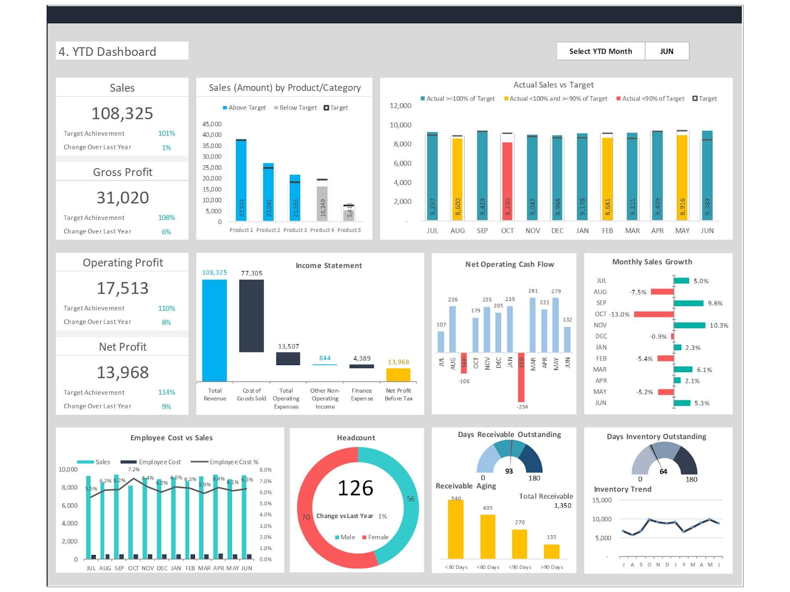
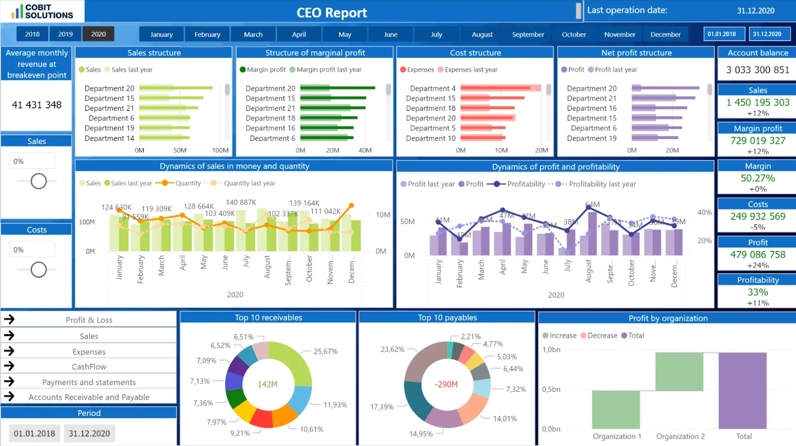
1. CEO Strategic Overview Dashboard
Best For: High-level strategic alignment for Chief Executive Officers.
A CEO Strategic Overview Dashboard is like the mission control of your enterprise.
It measures company-wide KPIs, such as:
- Revenue Growth
- Profit Margin
- Customer Satisfaction
- Market Share
And more!
What Data Do You Need for a CEO Strategic Overview Dashboard?
To create your CEO Strategic Overview Dashboard, you’ll need:
- Financial Reports
- CRM Data
- Operational Metrics
- Market Analytics
Which Data Visualization Tool is the Best for Making CEO Strategic Overview Dashboards?
From what I’ve seen, the best platforms for making CEO Strategic Overview Dashboards are Domo for enterprise-level needs or Microsoft Power BI for SMEs and startups.
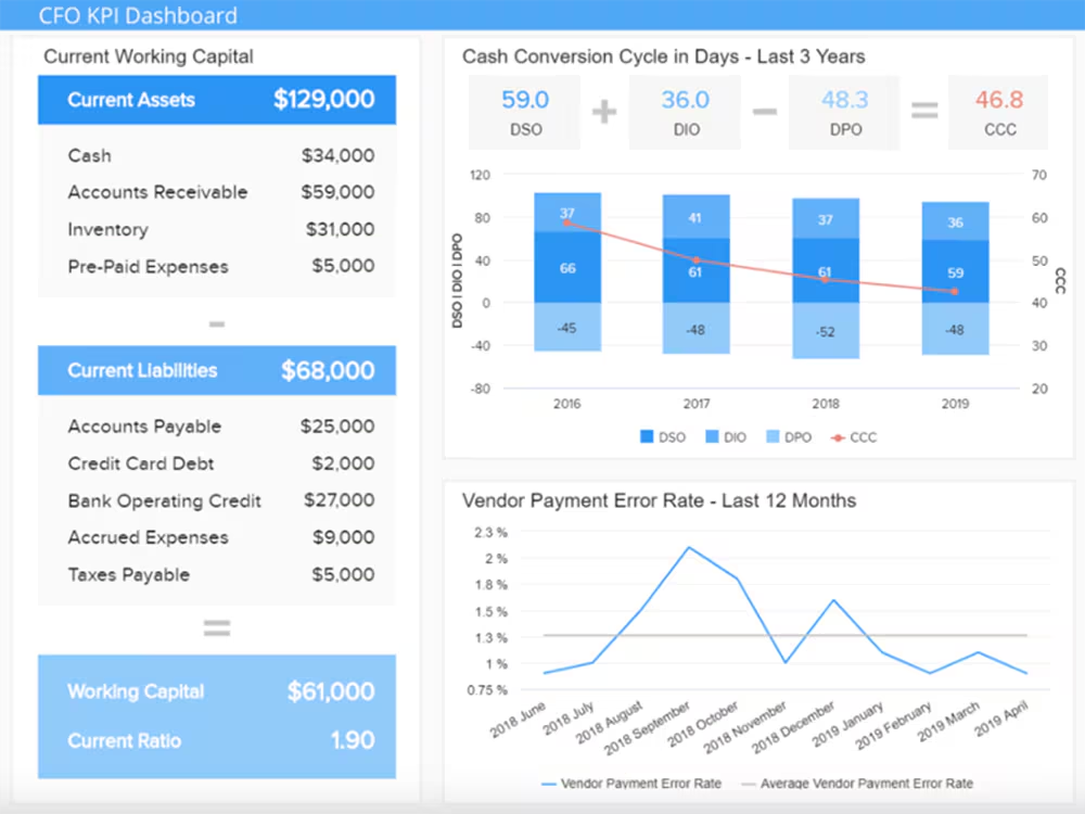
2. CFO Financial Health Dashboard
Best For: Financial oversight and forecasting.
The CFO Financial Health Dashboard helps you break down the underlying numbers that drive profitability. They measure KPIs like:
- Cash Flow
- Budget vs. Actual Expenses
- Debt-to-Equity Ratio
- EBITDA
What Data Do You Need for a CFO Financial Health Dashboard?
This dashboard requires limited but very structured data that you can get from:
- ERPs
- Accounting Software like QuickBooks or SAP
- Bank Statements
Which Data Visualization Tool is the Best for Making CFO Financial Health Dashboards?
CFO Financial Health Dashboards require robust data visualization tools. So, you might want to check out Tableau or Power BI for advanced financial modeling. Alternatively, if you’re operating Zoho and using their accounting software, Zoho Analytics is also an SMB-friendly option.
Also Read: Best Examples of Good Power BI Financial Dashboards
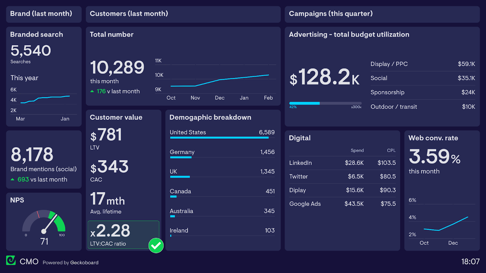
3. CMO Marketing Performance Dashboard
Best For: For CMOs who want to optimize marketing spend and engagement.
The CMO Marketing Performance Dashboard is designed to help you understand whether your marketing campaigns are working as intended. They measure KPIs like:
- ROI on Marketing Spend
- Customer Acquisition Cost
- Conversion Rates
- MQLs and SQLs
Plus, you can also create region- or market-specific reports for detailed breakdowns.
What Data Do You Need for a CMO Marketing Performance Dashboard?
Here’s everything you need to create your own CMO Marketing Performance Dashboard:
- Google Analytics
- CRM Data from HubSpot or Salesforce
- Ad Data from Meta, Google, Yelp, etc.
Which Data Visualization Tool is the Best for Making CMO Marketing Performance Dashboards?
In my experience, Google Looker Studio is a great free tool for creating CMO Marketing Performance Dashboards. They also integrate very well with Google Analytics and Ads.
If you want real-time tracking of marketing metrics, I suggest exploring Klipfolio!
4. COO Operational Efficiency Dashboard
Best For: COOs of manufacturing to streamline workflows and promote collaboration.
A COO Operational Efficiency Dashboard helps you visualize your production and operational workflows. They use KPIs like:
- Production Cycle Time
- Inventory Turnover
- Average Supply Chain Delays
- Employee Productivity
In short, COO Operational Efficiency Dashboards enable you to spot bottlenecks, optimize operations, and increase productivity.
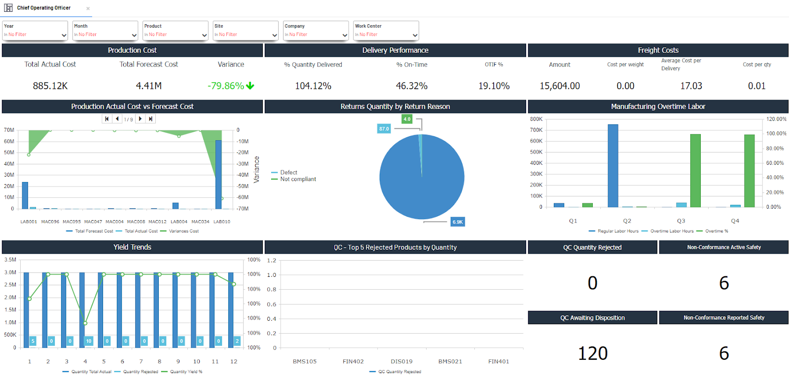
However, since a lot of operational data is often unstructured, you might want to work with an expert data visualization service provider to clean and structure your data for simple visualizations.
What Data Do You Need for a COO Operational Efficiency Dashboard?
To create a COO Operational Efficiency Dashboard, you’ll need:
- ERP Data through platforms like SAP or Oracle
- IoT sensors to track inventory and production
- Warehouse or logistics management software
Which Data Visualization Tool is the Best for Making COO Operational Efficiency Dashboards?
The best COO Operational Efficiency Dashboards I’ve come across were all created with Sisense, which integrates well with IoT devices, or Power BI, which offers good operations analytics capabilities.
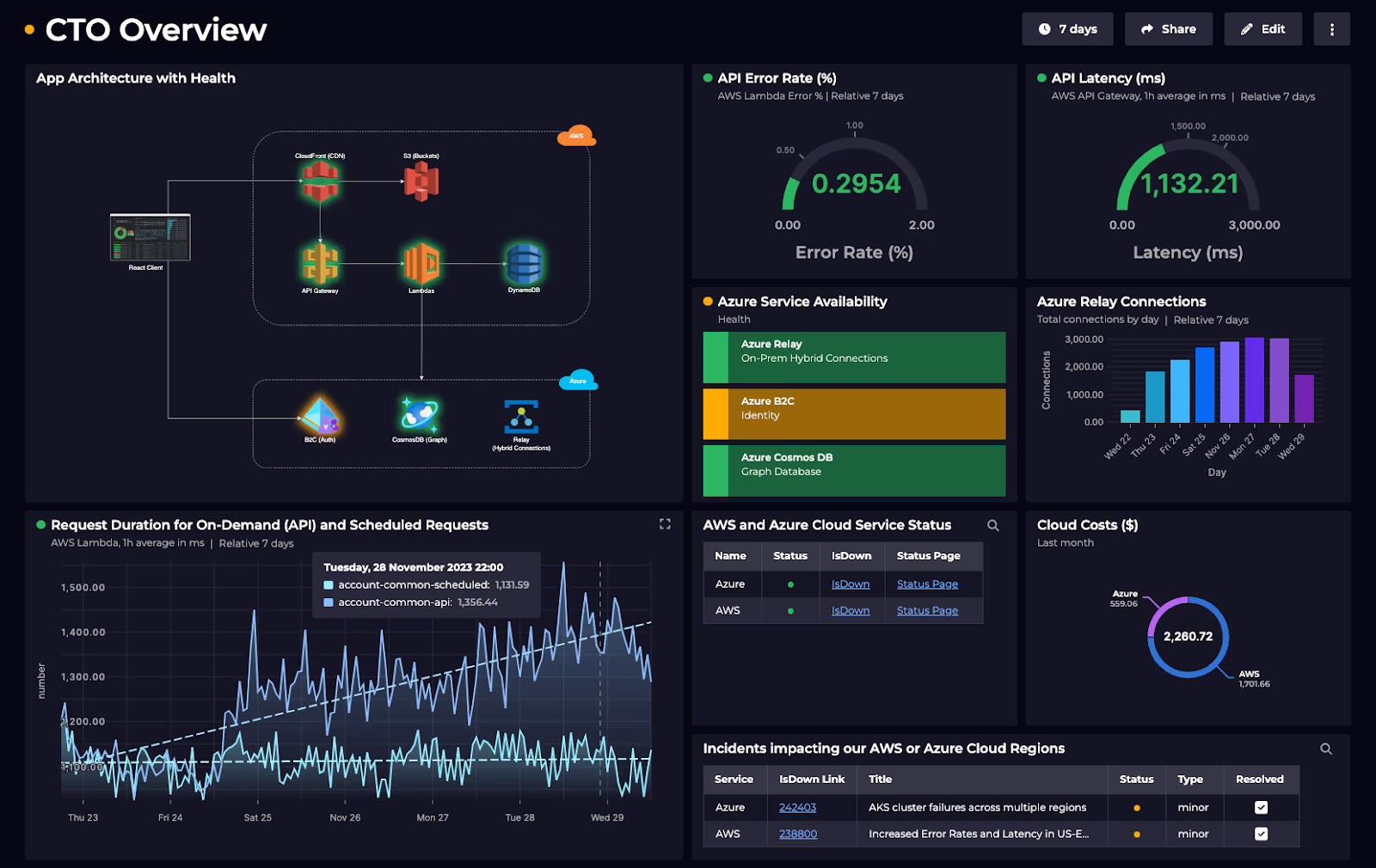
5. CTO Tech & IT Performance Dashboard
Best For: CTOs who want to measure tech scalability and ensure that the security protocols are working.
A CTO Tech & IT Performance Dashboard can be a critical report for your enterprise. It allows your IT team to track KPIs like:
- System Uptime
- Cybersecurity Threats
- DevOps Efficiency
- Cloud Costs
It’s also your best option to track the overall health of your digital infrastructure in one place.
What Data Do You Need for a CTO Tech & IT Performance Dashboard?
To create your CTO Tech & IT Performance Dashboard, you’ll need:
- IT logs through platforms like Splunk or Datadog.
- Jira for tracking DevOps cycles
- AWZ/Azure Cost Reports
Which Data Visualization Tool is the Best for Making CTO Tech & IT Performance Dashboards?
Grafana is a great platform for making CTO Tech & IT Performance Dashboards because it offers real-time monitoring. I would also recommend ThoughtSpot if you want to get AI-driven insights into your digital infrastructure.
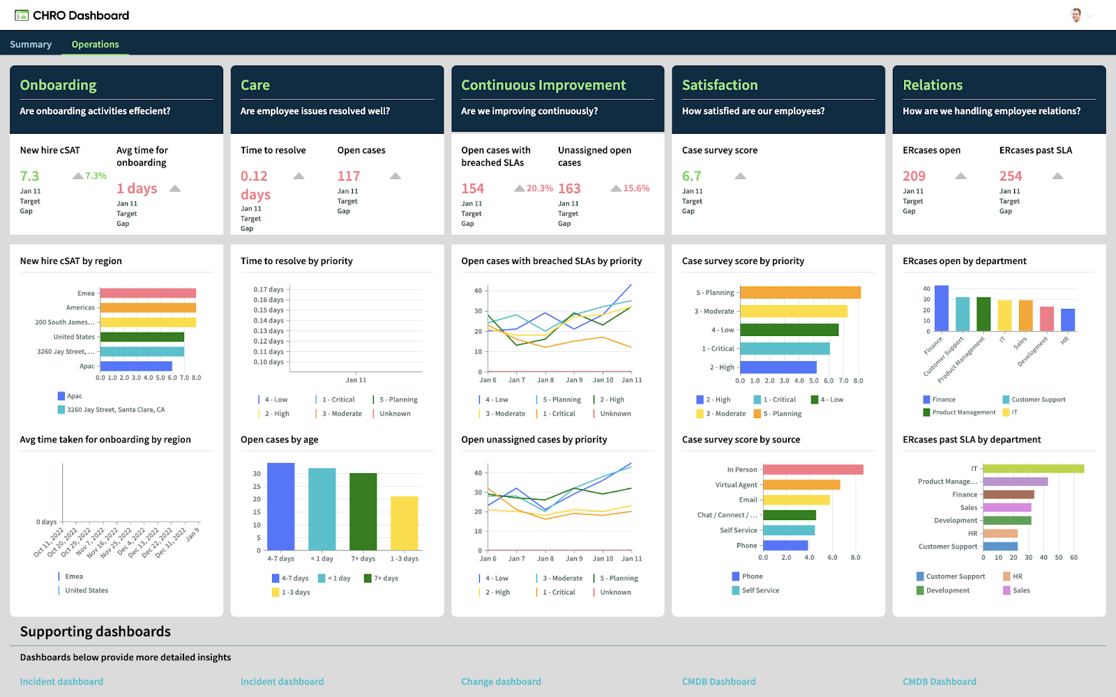
6. CHRO Talent Management Dashboard
Best For: Human resource executives who want detailed insights for workforce planning.
If you’re noticing a high churn rate or mounting hiring costs, what you need is a CHRO Talent Management Dashboard. It integrates with HR management and hiring platforms, measuring the following KPIs:
- Employee Turnover
- Training TOI
- Time-to-Hire
You can even use it to understand the skillset vs. requirements for your current workforce, so you know what profiles to hire in the next cycle!
What Data Do You Need for a CHRO Talent Management Dashboard?
To create your CHRO Talent Management Dashboard, you’ll need:
- HR Software data from platforms like BambooHR or Workday
- Past Performance Reviews
- Payroll Data
You can also add any other quantitative metrics that you collect for your workforce, such as average daily productivity per employee.
Which Data Visualization Tool is the Best for Making CHRO Talent Management Dashboards?
From what I’ve seen, Zoho People is a good platform for making CHRO Talent Management Dashboards. However, Visier is also good for people analytics, whereas Tableau and Power BI are evergreen solutions for HR Dashboards!
Also Read: Best Tableau Dashboard Examples for Executive Reports
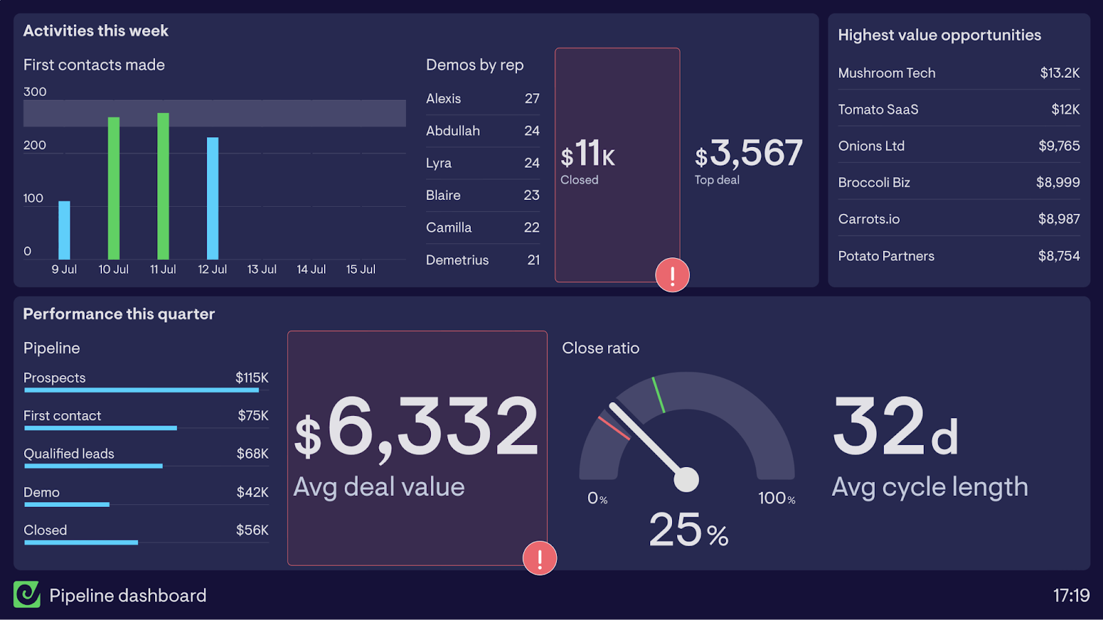
7. CRO Sales Pipeline Dashboard
Best For: Visualizing and analyzing revenue growth strategies.
One of the most important executive dashboards I’ve come across is the CRO Sales Pipeline Dashboard. It gives you a bird’s eye view of:
- Deal Velocities
- Win/Loss Rates
- Quota Attainment
- Churn Risk
It’s critical to your sales cycles, especially if you’re executing specific strategies like Account-based Marketing.
What Data Do You Need for a CRO Sales Pipeline Dashboard?
To create a CRO Sales Pipeline Dashboard, you’ll need:
- CRM Data from platforms like Salesforce or Pipedrive
- Sales Call Logs
- Customer Contracts
You might also want to integrate your prospecting platform, like Apollo.io or ZoomInfo, for measuring your outreach efforts.
Which Data Visualization Tool is the Best for Making CRO Sales Pipeline Dashboards?
In my opinion, you don’t really need a separate platform for making Sales Pipeline Dashboards if you’re already using a good CRM like Salesforce or HubSpot.
However, you might want to use Tableau or Power BI if you’re already using one of them to create all your other dashboards. It’ll ensure uniformity and quick collaboration.
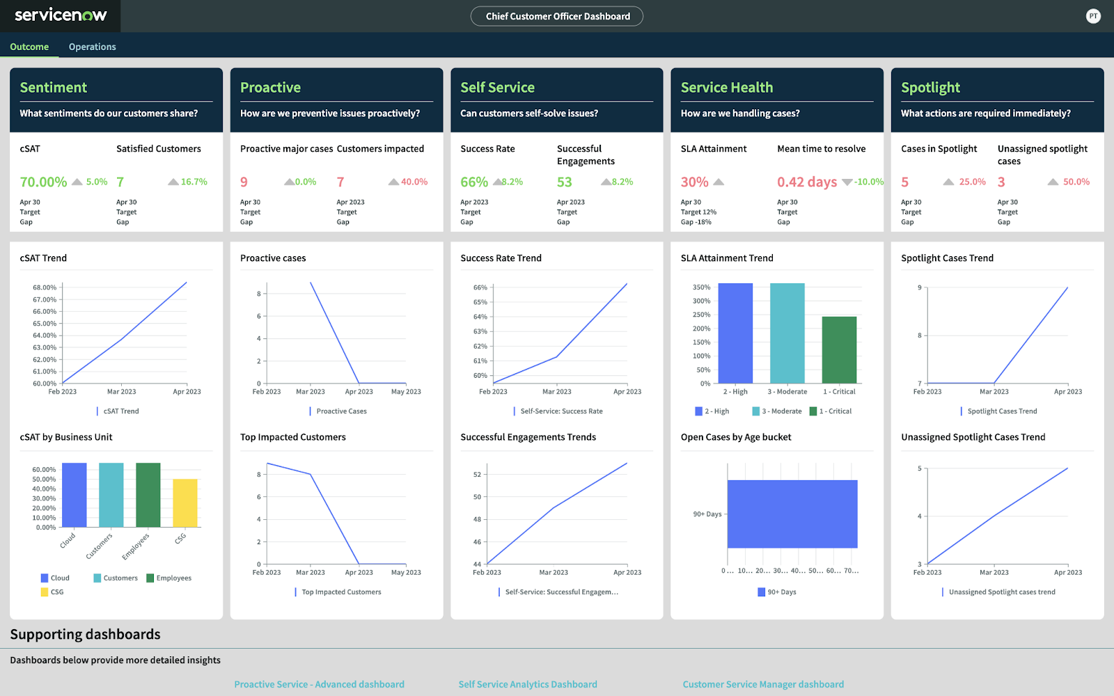
8. CCO Customer Success Dashboard
Best For: Improving customer retention rates for B2B enterprises.
If you’re running a high-value B2B operation where a few clients make up a huge share of your revenue, you absolutely need a Customer Success Dashboard. It’ll help you get an overview of:
- New Promoter Score
- Churn Rate
- Ticket Resolution Time
It’ll also tell you when and where you’re gaining or losing customers. Based on this, you can decide which strategies to double down on and which ones to modify.
What Data Do You Need for a CCO Customer Success Dashboard?
To create a Customer Success Dashboard, you’ll need:
- Zendesk Data
- Intercom Numbers
- Survey Tools like SurveyMonkey
- Ticket Resolution Stats
If you’ve recently implemented a chatbot on your website or app, you might also want its analytics to understand whether it’s improving your Cx workflows.
Which Platform is the Best for Making CCO Customer Success Dashboards?
I highly recommend checking out Gainsight, a customer success platform, for making Customer Success Dashboards.
Again, Tableau and Power BI are my standard recommendations if you’re already familiar with their ecosystems.
Pro Tip: You can hire data visualization services to help you structure and organize your scattered Cx data to create dashboards that deliver actionable insights.
9. Board of Directors Executive Reporting Dashboard
Best For: Board members who want to assess enterprise governance and maintain oversight.
I’ve saved one of the most important dashboards for last: the Board of Directors Executive Reporting Dashboard.
Its purpose is to provide a high-level overview to the most critical stakeholders of your enterprise and empower them to quickly grasp critical metrics like:
- Revenue Growth
- Risk Exposure
- Shareholder Value
It’s a complete breakdown of the consolidated company-wide information that captures your company’s financial and operational health.
What Data Do You Need for a Board of Directors Executive Reporting Dashboard?
To create a Board of Directors Executive Reporting Dashboard, you’ll need aggregated data from all departments, like finance, operations, sales, and others.
You might want to work with professional data engineers to create clean, structured datasets for building clean BoD Executive Summary Dashboards.
Which Data Visualization Tool is the Best for Making Board of Directors Executive Reporting Dashboards?
To create informative BoD Executive Reporting Dashboards, use heavy-duty data visualization tools like Domo or Power BI.
I’d recommend first trying Power BI, it’s easier to use and doesn’t compromise on data processing speed. However, if you find it too slow, you might want to explore Domo.
Create Your Executive Dashboard with Augmented Tech Labs!
Executive dashboards can help you break down complex data and make smarter decisions through visual insights.
And through this blog, we’ve shown you the kind of executive dashboards you can create, along with what data to pull and the best tools that get the job done.
But if you’re thinking: “I don’t have time to test 5 platforms…I just need one solution that works!”
Don’t worry: That’s where we at Augmented Systems come in!
We offer data visualization services that take your messy spreadsheets, SaaS tools, and legacy systems and turn them into clean dashboards that tell you exactly what to do next.
Think of us as your executive dashboard engineers: we do all the heavy lifting, from data collection and cleaning to report creation and sharing, so you can focus on what matters most: making profitable moves that drive growth.
Connect with today and start making better decisions for tomorrow!

Executive Dashboard Examples: FAQs
1. What is an executive dashboard, and why do I need one?
An executive dashboard is a real-time, visual snapshot of your company’s most critical metrics, like revenue, customer satisfaction, or operational efficiency. From what I’ve seen, successful executives use these dashboards to spot trends, avoid risks, and make faster decisions without digging through spreadsheets. Think of it as your business’s GPS, guiding you toward growth.
2. What are the key features of a good executive dashboard?
I’ve noticed that all good Executive Dashboards have the following features in common:
- Live data updates without any outdated numbers.
- Role-specific KPIs, such as CFOs track cash flow and CMOs monitor ad spend.
- Interactive charts and visuals for a simple breakdown of complex data.
- Multi-platform integration so you can pull data from CRMs, ERPs, and other sources.
- Shareability to instantly collaborate with key decision-makers.
I also suggest using expert data visualization services to create clean dashboards without investing too much time or resources.
3. Which executive dashboard tools are the best?
Based on my experience, I recommend the following Executive Dashboard platforms:
- Power BI: Best for Microsoft users.
- Tableau: Ideal for deep financial analysis.
- Domo: For enterprise-grade requirements.
- Google Looker Studio: A free tool for marketing teams.
- Klipfolio: Great for real-time sales/marketing dashboards.
4. How do I build an executive dashboard for my role?
Here’s my step-by-step approach to building an Executive Dashboard for your role:
- Pick your KPIs: CEOs need revenue growth; CTOs track system uptime.
- Gather data sources: CRM, accounting software, HR tools.
- Choose a platform: I suggest Power BI for beginners, Tableau for complex data.
- Design visuals: Bar graphs for comparisons, Line charts for trends.
- Share with stakeholders: Use built-in collaboration features for instant sharing.
5. Can executive dashboards improve decision-making?
Absolutely! I’ve seen companies cut reporting time by 80% and boost revenue by 15–20% just by using dashboards. For example:
- A CFO dashboard can flag cash flow issues before they escalate.
- A CMO dashboard reveals which ads drive the most ROI.
- A COO dashboard identifies production bottlenecks in minutes.