Can data visualization services transform your business? Or is it just another tool that promises more than it delivers?
Can charts and graphs really help double your traffic, capture the right audience and increase your ROI?
If these questions are keeping you awake, you are in the right place. Every tool promises different results, but the risk of disappointment is real.
Rest assured, we’ll help you make the right call. Dig in to see if business data visualization is really worth the investment or if there is something better left on the shelf.
What are Data Visualization Services?
Data visualization or data visualization services refers to converting and presenting your raw data into clear and actionable insights with easy-to-understand visuals. These visuals are presented using different visualizations, including graphs, charts, bars, and more.
Think of it as converting raw, complex data and numbers into meaningful information that your team and stockholders can easily and instantly grasp and make sense of.
Imagine presenting a quarterly sales report to a stakeholder. Instead of presenting a long list of numbers or a spreadsheet with messed-up rows, you use a graph to highlight the KPIs (Key performance indicators).
The result?
- The stakeholders are no longer lost in scrambled numbers.
- The visualizations are quick and instant.
- They can interpret what’s working and what needs improvement.
- They can make better decisions and identify future trends.
Business data visualization is a powerful tool to make your numbers more digestible. It helps you get your point across quickly and efficiently. Whether it’s your team, stakeholders, or your clients, data visualization helps them understand the story behind your numbers.
However, the big question still remains: Will Data visualization really help make smarter business decisions and create more effective strategies?
Keep reading to see how data visualization for decision-making can change the way your business interprets and leverages its data.
Why Should You Consider Business Data Visualization?
Do you know that images predominate the text? According to the International Forum of Visual Practitioners, the human brain loves pictures as it is naturally wired to absorb, process and communicate information through visuals.
In fact, 90% of the information transmitted to our brain is visual. Images are also processed 60,000 times faster than text and quicker than you can blink. For the same reasons, you should pay attention to the benefits of data visualization.
Think about it! When you look at a pie chart, doesn’t it feel like you are grasping the data way better than a mountain of numbers on a spreadsheet?
Whether you are tracking customer behavior, analyzing your sales report or predicting market trends, you are swimming in numbers. All of this data needs a translator to uncover the “Why” and “How” behind those numbers.
To know what exactly data visualization for decision-making brings to your table, let’s dig into its benefits.
Top 5 Benefits of Data Visualization
Data without visualization is like trying to solve a jigsaw puzzle without the picture in its box. You have the pieces (data), but it’s hard to see what they create or how they fit together.
Data visualization gives you a big-picture view. You connect the dots, see patterns and understand the story of your data. What are the other benefits of data visualization for decision-making? Let’s have a look.
1. Simplified Data Implementation
Data visualization makes your data easier to understand. It simplifies your messy and complicated data into patterns, trends and anomalies.
Data that would take hours to decipher with a spreadsheet or a table can be processed and understood faster with a well-designed graph or chart.
How can it benefit you?
- Integrate all your data from different sources into a single cohesive visual.
- Get real-time updates and reduce the need for manual data handling.
- Reduces the risk of misinterpretation or human error.
- Easy to navigate and faster to understand for new members.
From easily tracking growth to identifying the drops, data visualization helps you lead with clarity and offers efficient decision-making power.
2. Better Communications
You don’t want your end users, such as your team, clients, and investors, to be bombarded with dry numbers, right?
Data visualization is a great tool for communications. It acts like a universal language and makes it easier to share information with your end users regardless of their level of expertise or familiarity with the data.
The visuals add a cherry on top and ensure that even complex information is accessible and understandable for all.
How can it benefit you?
- Presents data in consistent visuals, ensuring everyone is on the same page.
- Share live interactive visuals with teams working remotely or in different time zones.
- You can improve your stakeholder engagement by presenting data-driven insights.
- Showcase a clear, engaging and easy-to-understand story.
- Foster collaborative discussions using interactive dashboards.
- Data becomes accessible to everyone regardless of their technical skills.
With data visualization, you can make your team or a boardroom full of executives grasp the key takeaways and collaborate with a well-designed visualization. Furthermore, you can make real-time updates with cloud-based tools, like Google Data Studio or Power BI.
3. Increased Customer Engagement
Wouldn’t it be easy to understand and respond to each customer personally? Of course, who wouldn’t want that? However, with so much data spread across different touchpoints, it’s hard to identify what they prefer or need.
Data visualization drills down into your data to explore customer trends and predict their future preferences. Interactive dashboards allow customers to filter based on different parameters and offer a personalized experience.
How can it benefit you?
- Use customized and personalized visual dashboards to show real insights.
- Offer clear reporting by breaking down numbers into graphs and maps.
- Make them feel more controlled by giving them direct access to their business performance.
- Strengthen their trust by helping them track and measure their progress.
Using interactive visualizations, you can understand your users’ needs and preferences and make adjustments in real time. When your users can engage with the data, they feel more prioritized, which, in turn, increases your customer engagement.
4. Enhanced Data Analytics
Imagine reading a massive book in one sitting. Now imagine reading it by breaking it into small chapters or sections. What’s more manageable, and what’s more overwhelming? The latter is manageable and enhances your power to understand.
The same goes for data. When complex data is divided into smaller chunks, it is easier to analyze. Data visualization does the same with graphs and charts. You can thus focus on one piece of data, see trends and make decisions without getting lost.
How can it benefit you?
- Identify trends, patterns and shifts over time quickly
- Break down large data sets into smaller segments for better and more targeted analyses
- Spot outliners or anomalies that you might have missed in your raw data
- Improve accuracy for better insights
- Simplify complex and multi-dimensional data
- Predict and forecast the future outcomes
With data visualizations, you can make faster decisions, make better strategic plans and have a deeper understanding of your customers.
5. Improve Decision-Making
Scrolling through pages of survey responses or acting on an issue after it gets bigger is a no-no for any business. Time is money. Good and faster decision-making is also important to grow in the ever-growing business industry.
Data visualization allows you to make faster and better decisions by detecting trends and spotting problems.
How can it benefit you?
- With up-to-date visual data, make real-time decisions.
- Have clearer business insights
- Access business performance and make adjustments as needed with KPIs.
- Make data-driven decisions and not decisions based on your gut.
- Take immediate action on key findings.
Data visualizations help detect declines in customer satisfaction, identify sales opportunities, and understand shifts in market demand before competitors do.
In a race to make better, faster decisions, a picture is indeed worth a thousand spreadsheets.
If you really want better outcomes, improved business productivity, enhanced customer experience or identified growth opportunities, start leveraging the benefits of data visualization today.
The Challenges of Data Visualization
We all know what goes into building a strong, well-designed house (the foundation, costs, workforce, intricate details, interiors, and so much more).
Data visualization for decision-making is like building a house. The goal is clear: a reliable and designed visualization that points towards the right decision. However, the path to get there isn’t always simple. One wrong decision can lead to confusion instead of clarity.
In data visualization, the challenges lie in the following:
- Selecting the right tool
- Choosing the appropriate visualization method
- High initial costs
- Poor designs
- Low data quality and inaccurate data
- Over-reliance on the visualizations
Ways to Overcome these Challenges:
- Select the right tool that suits your business needs.
- Make sure that the visualization type you choose is easy to interpret
- Be careful with the visuals. Do not overwhelm or mislead your audience.
- Be prepared for the financial commitment that comes with high-quality customized visualizations.
- Do not make poor decisions that can lead to confusion. Make clear and accurate designs.
- Verify your data beforehand and ensure that there is no missing or misleading data.
Overcoming these challenges is not a hard nut to crack. Data visualization for decision-making just needs the right structure, tools, techniques and approach.
Furthermore, the data visualization future trends, including AI (artificial intelligence), AR (Augmented reality), and Virtual Reality are even more fascinating.
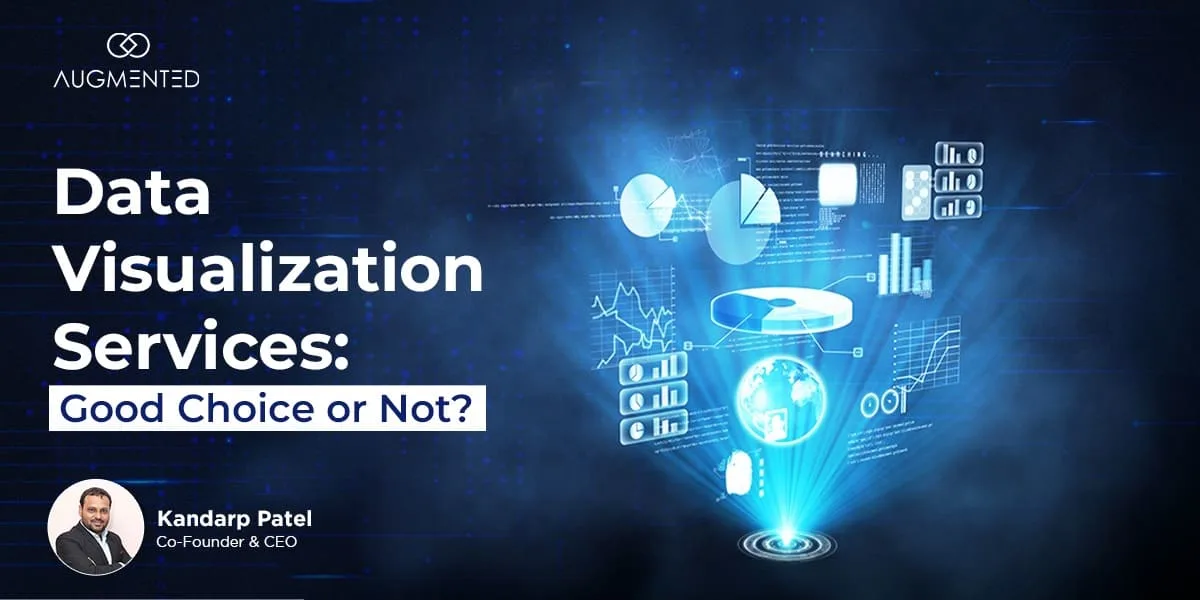
Are Data Visualization Services the Right Choice?
Yes, data visualization is absolutely the right choice. Data visualization helps you spend time making better business decisions and taking your business to new heights.
But do you know what the real question is: Can you afford not to invest in it? With the ever-growing data, staying ahead means making quick business decisions confidently. Data visualization helps you do that and lets you stay ahead in the game.
However, for smaller businesses with limited budgets, it could be difficult to justify unless you can demonstrate a data-driven need. You can ask yourself questions such as:
- Do you have large and complex data that needs interpretation?
- Are there non-technical stakeholders for whom you need data-driven insights for better communications?
- Do you have the budget to invest in the tools and expertise?
- Do you want to improve the accuracy of your reports?
- What is it that you want from your visualizations?
If you answered yes to all the above questions, why wait? Start visualizing your data. You can start by talking to a data visualization consultant at Augmented Systems.
How Augmented Can Help?
Our data visualization consultancy team and developers help you craft impactful stories that turn your data into narratives for strategic growth and innovation.
We won’t give you cookie-cutter solutions. Instead, we will understand your needs, collaborate with you and personalize the solutions for your unique needs.
If you are ready to change your business for the better, contact our data visualization experts today.
FAQs:
Q1. What is bad or misleading data visualization?
Bad or misleading data visualization distorts or confuses the viewer, often by using manipulated scales, improper chart types, or incomplete data.
It can exaggerate or obscure trends, misrepresent proportions, or lack clarity, leading to inaccurate conclusions.
Effective data visualization should be clear, accurate, and contextually appropriate.
Q2. What is the future of data visualization?
The future of data visualization is in Virtual Reality (VR) and Augmented Reality (AR). These immersive technologies can transform how we experience information.
Imagine using a VR headset to explore your data or overlay insights onto your surroundings with AR, making the experience more interactive and intuitive.
Q3. How is data visualization used in businesses?
Data visualization in business is used to simplify complex data, identify trends, and make informed decisions. It helps businesses analyze performance, track KPIs, improve communication, and uncover insights that drive strategy and growth.
Q4. Why do modern businesses need data visualization?
Data visualization empowers business users to extract insights from vast datasets, identifying patterns and anomalies. Charts, graphs, and dashboards allow users to grasp insights and trends quickly, enabling better decision-making and data literacy.
Q5. What is a data visualization consultant?
A data visualization consultant is a specialist who assists businesses in creating clear visual representations of data. They develop charts, dashboards, and interactive graphics to enable organizations to analyze, interpret, and communicate data insights more effectively.